Convince with Simple Fonts

35

Do you need to convince a customer to complete an application form? Or, for a non-profit, do you need volunteers for a charity event? In both cases, you will be more successful if you describe the task in a simple, easy to read typeface. Research by Hyunjin Song and Norbert Schwarz shows that the way we perceive information can be affected dramatically by how simple or complex the font is. In particular, their work found that a simple font was more likely to get the readers to make a commitment. Here’s the whole story…

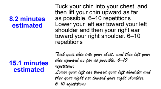
The researchers expected that getting people to commit to an exercise regimen would depend on how long they thought the workout would take. A longer estimated time would be a bigger commitment, and people would be less likely to sign up. That’s all simple logic, but Song and Schwarz decided to test two groups of subjects. The first group saw the exercises described in a simple font (Arial), while the second group saw the exact same text presented in a harder to read font, Brush.

Text fonts change user estimates of time for exercise.

The results were astounding – the subjects who read the same instructions in the hard to read font estimated that the regimen would take nearly twice as long, 15.1 minutes vs. 8.2 minutes. Needless to say, the group that thought the exercise would take only 8 minutes was significantly more likely to commit to the regimen. (See If It’s Hard to Read, It’s Hard to Do – Processing Fluency Affects Effort Prediction and Motivation.)

Song and Schwarz performed a similar experiment involving a sushi recipe. Subjects who saw the instructions in Arial estimated that preparation would take 5.6 minutes, while those who read the directions in Mistral, a more complicated font, expect it to take 9.3 minutes.

The clear Neuromarketing takeaway is that if you need to convince a customer, client, or donor to perform some kind of task, you should describe that task in a simple, easy to read font. Since this phenomenon is related to the concept of cognitive fluency, you should also make the type size easy to read and use simple words and sentence structure. These steps will minimize the perceived effort needed to accomplish the task, and your success rate will increase.

35 Comments
  1. Alexandre Bigaiski says

    O love simple things. You don’t have to put things that aren’t necessary. Great.

  2. Dr. Pete says

    Wow, that’s fascinating. Obviously, the second font is harder to read, from a usability standpoint, but I didn’t realize the cognitive implications. Great food for thought.

  3. Charlie says

    This is a real insight into page design in general – anything that breaks down information content, makes it clearer – makes it seem easier,reasonable, agreeable.

    Spam site owners (selling ‘eBooks’ on SEO, PPC etc) seem to have known this for ages.

    On the upside the underlying priciple lends support to the use of clean fonts, orderly grid layouts etc – which I instinctively see as good design basics.

    One final comment – try this with your emails as well – simple, short sentences, with a line space between each are much more likely to get read.

  4. Susanne says

    I wouldn’t have thought of that ever, it really does have a big effect!

  5. Tom Wueste says

    Great insight. So does it follow that if you want to convince somebody that a process is complex or sophisticated, a harder to read font would help?

  6. Roger Dooley says

    Yours is the great insight, Tom. Indeed, there is data that confirms what you suggest. If for some reason you want to increase the apparent complexity/difficulty (e.g., to justify a higher price), the more complex font would likely help.

    Roger

  7. Dr. Pete says

    @Tom – that’s something that used to come up a lot in human factors research. If, for example, a big, complicated machine had a tiny button to turn it on, people would get uncomfortable. Put a giant lever or a complicated keypad on it, and they would be more at ease, even though the machine was now harder to turn on. Our expectations of how complex we think something SHOULD be can be important – sometimes, more complex is actually better.

  8. Rukhsana says

    I wish I had realizes it earlier____ nevertheless its never too late.

    In my future publications specially for children i should be more particular about the simplicity of fonts.

    In the beginning when I started on computers I was greatly fascinated by fancy fonts and tried to use them in all my writings, but gradually it dawned on me that there aren’t many people who appreciate it.

    Thanks,
    Rukhsana

  9. Ana YourNetBiz Mentor says

    Great study: Arial it is!

    Best,
    Ana Hoffman

  10. Dina says

    Thanks for the great info! Being a graphic designer, I understood that subconsciously, but never was able to put it into words.

  11. Elaine Fogel says

    I’m not surprised. Sometimes, all it takes is testing readability and comprehension by showing forms to a few objective people. Thanks for sharing this study.

  12. Roger Dooley says

    There’s always Comic Sans, Ana! 🙂

    Dina, I think it’s good that you sensed the effort needed to read the more complex font. All too often designers work for a “look” and what the user does with the page is secondary.

    Roger

  13. Ron Biggs says

    Is there a study that you know of that addresses the use of ALL CAPS in text attempting to be either persuasive or instructive?

    1. Roger Dooley says

      I haven’t seen one, Ron, but I can think of two reasons that all capital letters would be less effective for either persuasion or instruction:
      1) For most people, text in capitals is harder to read than normal case text, so you have the same problem as hard-to-read fonts.
      2) Since the early days of online communities, email, and social networks, use of all caps has been associated with “shouting” and/or clueless newbies. Neither is positive.

      I think occasional use of all caps to emphasize a word, phrase, or sentence would be fine. Personally, I’d avoid use of all caps for whole text blocks.

      Roger

  14. rioca smith says

    when we write in big fonts that’s considered shouting no?

    1. Roger Dooley says

      CAPITALS are generally more associated with shouting, Rioca. Big fonts in the wrong context could have the same effect, of course, but used in proportion to other design elements can improve readability.

      Roger

  15. zoom says

    I always go for simple fonts. I have seen a use of fonts lately that look more like an image file but are actually fonts. These are great for SEO and the overall look of the website. Just my opinion.

  16. Carnell says

    @zoom I myself have seen that on a few blogs. I think it has something to do with Google’s font API. I have not implemented it myself. I just caught a discussion about it in a forum. I know it does look really nice though and uses little server resources.

  17. Patrick from Make Money Buzz says

    Very interesting…

    I wonder how people would do if you had a paragraph but highlighted the important parts. I see in a lot of blogs, authors do that to make their message easier to comprehend but I wonder what the science is behind that

  18. Ivan Guel says

    This is a simple detail that will definitely go a long way. If you thought this was interesting, compare both arial and times roman on screen and print. You will notice that on print, times roman is easier to read, as opposed to arial, which is easier to read on screen.

    Typography is clearly an art that many people take for granted. If the ad does not interpret proper typographic elements, the ad will not be effective. Mindfulness to typographic flow, cohesive to image, content and concept, remembering that all elements within the ad must have a relationship.

  19. farrosi says

    Great insight. So does it follow that if you want to convince somebody that a process is complex or sophisticated, a harder to read font would help?

    1. Roger Dooley says

      As weird as it sounds, farrosi, that is correct. Harder to read = more effort attributed to activity.

      Roger

      1. Shaun Smylski says

        Roger is almost correct, but I would add that a more complex layout of text and adding more information would be better than sacrificing legibility. Doing those two things will also convince people of a complex process. Making your font look illegible will lead to being discredited in being capable of handling proper documentation.

        1. Roger Dooley says

          I agree, Shaun. At some point, the disfluency effect reaches illegibility, negating any gain.

          Roger

  20. Shaun Smylski says

    Don’t use a sans-serif like Arial, use a serif. just like Ivan Guel has said. Open any novel and you will have your evidence of good legible serif type. Serifs were invented for reading body text faster and easier, sans-serifs were made for large typeset and digital displays. In the case of Arial, its best suited for digital displays only. Times New Roman and Arial are the most discriminated fonts in the Type Industry. Try to stay away from them if you can.

    Try some of these serifs, some are better for display others for print, make sure to adjust your font size accordingly: Caslon, Bodoni, Century, Garamond, Goudy, Palatino, Sabon, Baskerville.

  21. Charlie says

    Love the connotations past readability. Hadn’t ever thought about it like that.

    Harder to read, harder to do.

    Fascinating! 🙂

  22. Cathy Presland says

    really enjoyed seeing the evidence to back up what i was pretty sure about already 🙂

    Good article – thanks

    Cathy

  23. Saku says

    Impressive findings. I’ve always been wary of what fonts and colors to go for. Think of the elderly: can they see your texts? If not, aren’t you missing out on a growing potenetial…
    Saku

  24. […] Real difficulty includes many expected categories of barrier: long forms, confusing user interface, awkward payment procedures, and so on. Imagined difficulty is much more insidious: a step to completing the process may be easy enough, but it may seem more difficult in our mind due to disfluent design. (See, for example, Convince with Simple Fonts”.) […]

  25. Mitchelee says

    That’s amazing! It makes me wonder… How many other aspects of computer text effects the outcome of a readers actions?

  26. […] a simple font because it’s easier to read and more […]

  27. […] a study by Song and Schwarz, people were able to follow directions written in a simple font nearly twice as fast as those […]

  28. […] This study shows how important font choice is.  Subjects were given an exercise regimen, and the ones with the more readable font type predicted the workout would take almost 7 minutes less than those with a fancier font. So the people with the simple font were more likely to commit to the workout regimen. […]

  29. Neil says

    That’s all well and good…but I can’t remember the last time I saw a so-called fancy font used on a webpage – if ever. So it makes the whole, which font is best, discussion, a bit on the redundant side, really.

    1. Roger Dooley says

      Surprisingly, one does see disfluent type design more often than one would expect. Fancy fonts, dense leading, low contrast colors, reverse type, busy backgrounds, etc. all have a similar effect.

Leave A Reply

Your email address will not be published.