The Power of Text
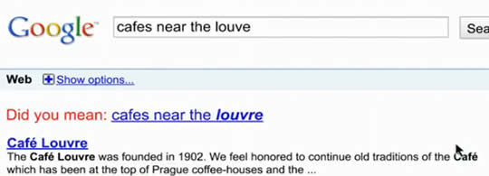
What makes an engaging television commercial? If you think visual and auditory appeal – action, sound, music, people, color, etc. – you would usually be correct. Ditto for high production values. An exotic location might help, too. But the recent Super Bowl provided an example that should warm the hearts of copy writers everywere: the Google “Parisian Love” ad. Here’s the ad that represented Google’s entry into the big league of Super Bowl advertising:
When you view the ad, you’ll notice that it differs from the typical Super Bowl commercial, and indeed, from almost any television spot that you have seen. There are no dogs, horses, or monkeys. No scenery. No fast cars. No gorgeous women. In fact there are no humans at all. Other than a few small, fleetingly-seen maps, the only graphic element is the prominent Google logo.
What the ad DOES have is TEXT… lots of text. Not only does the ad have text to read, but there’s plenty of spurious text that the viewer has to ignore while trying to keep up with the rapidly changing screens. Just as in real Google searches, multiple suggestions are shown, as are multiple results for each completed search. Despite the quick screen changes and irrelevant content, though, viewers can easily follow the story spelled out by the searches.
So, to recap so far… Google decided to spend nearly $3 million to air an ad that cost next to nothing to produce, has no actors or CGI animation, no cute animals, nothing but a series of words typed into a search boxes and the generated search results. At first glance, this might sound like E-Trade’s famous, “We just wasted $2 million bucks” ad, but it’s not.
In fact, this unlikely ad was highly effective.
How do we know? One indicator might be critical acclaim. Every year, marketing profs at Michigan State University rank the Super Bowl Ads, and this year their top choice of the 60 commercials was Google’s ad. Their reasoning was “…fantastic story, low production costs and the surprise factor. It sells what they do in a simple way.” (See MSU profs rate Google ad top Super Bowl commercial.)
A more telling indicator, though, might be how people responded physically and emotionally to the ad. Sands Research conducted a study of all 60 or so ads that aired during the 2010 Super Bowl (see Super Bowl 2010 Ad Winners), and Google’s Parisian Love ad came in at #4 in terms of what Sands calls “neuro-engagement.” That an ad consisting entirely of text could outscore nearly all of the other Super Bowl ads was a surprise, according to Stephen Sands, founder of Sands Research. Sands commented that in addition to the high neuro-engagement score, the Google ad was one of the most-remembered ads when the subjects were surveyed after the experiment.
The neuromarketing takeaway from this is that even in a highly visual medium like television, properly used text can beat commercials with amazing imagery and production values.
From a branding and memorability standpoint, having a giant “Google” logo on the screen much of the time is likely a good thing. But what made this ad work is that the text told a compelling story. I’ve written about the power of stories in advertising in Your Brain on Stories, as has Brian Clark at Copyblogger (How to Write a Story That Sells, 37 Seconds to Great Storytelling). This remarkable Google commercial is further proof that text can be amazingly powerful when it tells a story.

