Dark Patterns: How Even Savvy Users Get Tricked
I’m constantly asked whether using brain and behavior science to market better is manipulative. (My answer: not inherently, though any technique can be abused.)
In fact, there’s a much more common and insidious technique: using a confusing or skewed user interface to trick people into doing something.
I first met Harry Brignull, founder of the website DarkPatterns.org, at the Conversion Summit in Frankfurt. One might say that a “dark pattern” approach is conversion optimization carried to an unethical extreme. It goes beyond guiding the customer or visitor to the desired action and actually tries to dupe them into doing it.
Here’s Harry’s simple definition:
A Dark Pattern is a user interface that has been carefully crafted to trick users into doing things, such as buying insurance with their purchase or signing up for recurring bills.
Roach Motels and More
 The DarkPatterns website illustrates various categories of tricky UIs, like “Bait and Switch,” “Privacy Zuckering,” and “Roach Motel.”
Roach motel describes a process that’s easy to start (say, signing up for a subscription) but difficult to stop (by hiding the cancellation procedure or making it difficult).
The nickname comes from Black Flag’s trademarked Roach Motel insect trap, famous for the tagline, “Roaches check in, but they don’t check out!”
Roach motel UIs make it easy to take an action but difficult to undo it.
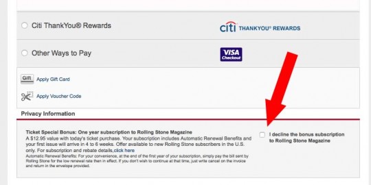
In this example from LiveNation.com, during the checkout process a paid subscription to Rolling Stone is offered. That’s no problem by itself, as the market demographic is no doubt a good match.
But, when the checkout process was captured recently by a DarkPatterns contributor, the customer had to proactively tick a checkbox to avoid starting the subscription. The customer was opted-in to the paid extra by default!
I’m certain many users quickly scan the headline about a bonus subscription offer, note that the checkbox wasn’t checked, assume that one would have to check the box to add this item, and move on. It’s hard to imagine that many users would read the dense paragraph of text, which includes an unmarked link for more information, or even read the explanation of the checkbox.
The Roach Motel aspect comes from the mechanism for canceling an unwanted subscription. The visitor who fails to check the “decline subscription” box is opted in as a paying subscriber, and must cancel by postal mail.
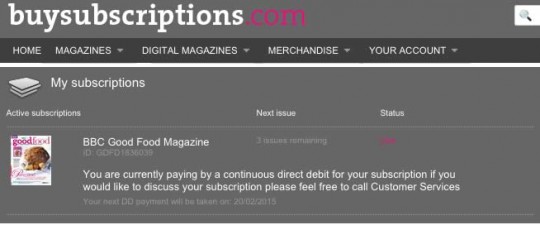
Another recent roach motel example from the DarkPatterns site is BuySubscriptions.com, which sets you up for magazine subscriptions paid for by directly debiting your account. To cancel, you have to telephone their customer service department.
LinkedIn: Sneakier Than You Think
A couple of years ago I wrote an article at Forbes, LinkedIn’s Sneaky Social Engineering. I highlighted the fact that while LinkedIn admonished members to connect only with people they know and trust, the user interface for contact requests was totally skewed to accepting any connection.
Now, Columbia student Dan Schlosser has created a far more in-depth analysis of how LinkedIn manipulates users in LinkedIn Dark Patterns: Why Your Friends Keep Spamming You to Sign Up for LinkedIn.
Not only does LinkedIn make every effort to trick you into importing your mail contacts into their service, they then invite you to connect with people not actually on LinkedIn. When you click their name to connect, it spawns an invitation to join LinkedIn. Hence, there is a surprising number of spammy invites sent to non-members.
One-Click Spamming
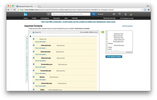
In fact, Schlosser shows, LinkedIn makes it easy to invite every contact you have to connect. Some might find that capability useful, though I find it hard to imagine a scenario where that makes sense.
But that’s where LinkedIn’s approach tricks you – if your contact’s email isn’t in LinkedIn’s database, you’ll generate an email invitation to join LinkedIn.
Schlosser notes:
It also shows up in the contacts manager, where it only takes one click to both connect with every person in your contacts who is on LinkedIn, and to send a “Join LinkedIn” email to every person in your contacts who isn’t…
“Invite selected Contacts” will send 2690 emails: some inviting to connect, others inviting to join LinkedIn.
That’s just one of many ways LinkedIn’s UI makes it easy to give up your contacts. Check out this step in the signup process.
Add your email, and click the big “Continue” button, right? Oops, you just imported your contact list. If you didn’t want to import your contacts, you should have clicked the little “Skip this step” link in the corner. Gotcha!
I highly recommend Schlossers article, which explores in great depth how LinkedIn has evolved its user interface with a major focus on tricking you into sharing your contacts. It’s well-illustrated with screenshots and makes a definitive case for LinkedIn’s use of a “dark pattern” UI.
Have you been tricked into sending LinkedIn invites? #UX pic.twitter.com/1H9GsABXkD Share on XBeyond the Grave
One of the more unsettling suggestions from LinkedIn came just a month or two ago when it suggested I connect with my deceased Mom using a 10-year old email address.
Yes, I got tricked into importing my contacts months earlier. I had successfully avoided the dreaded “Continue” button every time I manually added a contact. I did this hundreds of times. (In the case of the “added a contact” confirmation screen, “continue” didn’t take you back to your home screen or some other logical destination. Instead, it initiated an import activity.)
But, in one distracted moment, I must have slipped.
Now, my LinkedIn suggestions are peppered with names and emails harvested from my own contacts. And, although my mother hadn’t used that email for a decade or more, LinkedIn surfaced it and put it in the first row of suggestions.
This kind of thing makes me actually look forward to more effective use of Big Data.
In this article, Schlosser also provides instructions to navigate the complex process of undoing your contact import at LinkedIn and reducing the probability of generating spammy invites.
Why We Are Fooled
UX and UI designers play an important role in the creation of successful websites. They eliminate elements that cause confusion, and strive to design an interface that is as intuitive as possible to the user.
If the site is an e-commerce site, they make it easy to find and compare products, and easy to buy them.
We’ve all encountered sites that left us confused and frustrated as we tried to complete what should have been a simple activity. This is what UX and UI designers seek to avoid through testing, observation, and the application of established principles.
But, like a surgeon turned serial killer, a dark patterns designer uses the same tools to guide users into unexpected and perhaps costly actions.
Attention
Experienced web designers know that they rarely have the full attention of their visitor. Users may be distracted by other things happening on their device (like app notifications), by other devices (most of us use several simultaneously), by phone calls, and so on.

Steve Krug’s famous book, Don’t Make Me Think, emphasizes the importance of making every aspect of the site intuitive. Visitors simply won’t read your instructions. They won’t hunt around for the next step they are supposed to take. Make them think, and they’ll leave.
I’ve encountered designers who take a laptop or phone to a bar to ask slightly tipsy patrons to test an interface. If those users can do it, perhaps sober but inattentive users can.
Dark patterns designers use this expected lack of attention by masking explanations in text that won’t get read while making the choice they want you to make look obvious and simple, like a big “Continue” button
We can call for an elevator without conscious thought because we know what the “up” button does. Instinctively, we assume that a “Continue” button simply advances us to the next step in the process and, when distracted, may miss the fact that it’s initiating something we didn’t expect.
Friction
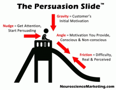 My Persuasion Slide™ model makes elimination of friction a key element in the persuasion process. Good designers know this, and make it easy for visitors to complete their intended action.
Dark patterns designers use friction and the principles of choice architecture to guide visitors down an unexpected path, and also to make reversing actions difficult.
To use LinkedIn as an example, they make connecting your email account the easy and obvious choice. There’s so little friction that we can take this step unconsciously, as I apparently did at one point.
But, as in the roach motel examples above, reversing this action is high friction. There’s no simple “undo” or “disconnect” button. Rather, there’s a complicated series of steps that isn’t particularly well documented.
People are inclined to choose whichever path looks easiest. Adding a paragraph of text to the choice you don’t want them to take will make them less likely to choose that option. Making that text low contrast and small will make it even less likely.
And, of course, choice architecture studies show that the default option is almost always the most popular. No action required means minimum friction. That’s good if you are trying to get people to, say, enroll in a retirement plan. It’s not so good if you are going to drop an unwanted item into their order.
Dark Patterns designers trick you by manipulating attention and friction. #UX pic.twitter.com/1H9GsABXkD Share on XAn ethical designer makes things easy for the user by eliminating friction. A dark patterns designer eliminates friction for the path he wants the user to take, and increases friction for alternatives that might be better for the user.
Fight Dark Patterns
 Marketers are one of the least-trusted professions, and interfaces that trick users into unexpected actions further tarnish our reputation.
I’d encourage you to expose these techniques when you see them. Often, a little daylight may be all that’s necessary to get businesses to clean up their act. (You can immortalize your discovery at the DarkPatterns.org website.)
So, ave you been tricked by LinkedIn or any other site? Share your experience in a comment!
Dark Patterns: How Even Savvy Users Get Tricked #UX #UI pic.twitter.com/1H9GsABXkD Share on X
