How the TMI Effect Cuts Your Sales, and 4 Ways to Avoid It

[This is a guest post by Liraz Margalit, Ph.D.]
Grab this post as a PDF! We made it easy – download it as a 10-page ebook by clicking here!
What’s the primary focus of most ecommerce sites? It’s almost certainly the product (or products) they sell. But, that shouldn’t be the only focus.
Product Focus or TMI?
Product information is thought to be a crucial factor in the purchasing experience. According to the American Express Retail Monitor, 85% of retailers view providing product information as a key factor in attracting consumers.
Hence, the common assumption about eCommerce product pages is that exposure to reviews, product details and technical specifications increases the likelihood of purchasing the product.
However, some analyses of eCommerce websites we conducted for retailers revealed surprising behavior: visitors who were exposed to additional details and information about a product were actually less likely to purchase it compared to visitors who were exposed only to the product image and a few general details.
These results show that a few details are good, but too much information can be bad – the TMI Effect.
?
The TMI Effect: Too much product info can hurt sales. #CRO pic.twitter.com/k2M4hg1rga Share on X
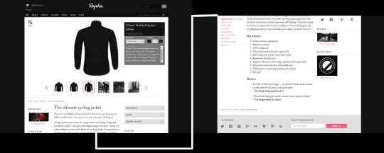
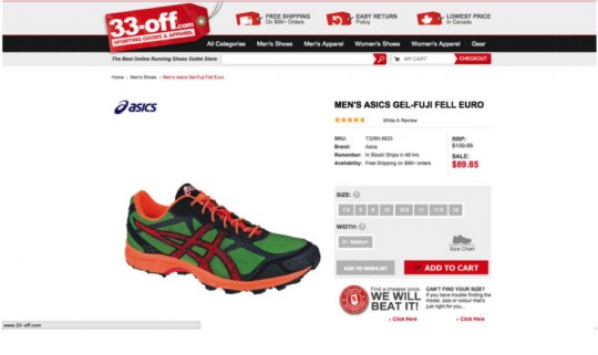
The images below demonstrate a product page that contains the product image and general information compared to a product page that contains detailed information about the product.


Ironically, customers are not aware of the effect that ‘too much information’ has on their behavior. When asked, they repeatedly state that being provided with information about the product before purchasing plays central role in their purchasing decisions.
That asking customers what they want yields inaccurate results won’t surprise Neuromarketing readers, but many companies actually trust this kind of data when making important decisions.
Logical vs. Emotional Response
Classic economic theory describes consumers as rational economic actors that select an alternative only after considering all relevant information.
The logical process may, in fact, be a key factor in some considered purchases such as insurance or highly technical products. These and other products have to meet specific criteria and important customer goals.
But, logic can actually be detrimental to the retail consumer industry, where emotional decision-making and impulse purchasing play a central role.
We like to think of ourselves as rational creatures, absorbing information, weighing it carefully, and making thoughtful decisions. In fact, many of our most crucial choices are made by what we call hunches, gut feelings, and somewhat automatic reactions that are beyond or beneath consciousness.
Although we like to refer to this feeling as intuition (“I had a very good feeling about this house), the reality is that this “intuition” is an established part of Emotion-Based Learning.
How Intuition Is Shaped
We are born with automatic mechanism that memorizes our emotional reaction whenever we are faced with a new experience. These emotional reactions, positive or negative, are stored in our memory.
When we face similar situations in the future, those stored memories will be expressed as a ‘hunch’ in order to guide our decisions. For example, if a child is bitten by a dog, the next time he sees a dog he will ‘intuitively’ know how it feels from a representation of the feelings stored in his memory.
Alternately, a husband can, from past experience, sense that “this is going to be a long hour” by the way his wife says that ‘”everything is o.k.”, even before talking to her.
In essence, intuition is a learned way to deal with new situations and interactions based on the emotional memory of past events without having to consciously process them again.
The Role of Emotion in Decision Making
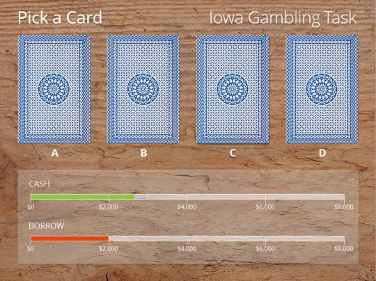
Researchers at the University of Iowa asked participants to pick one card at a time from four different decks while their physiological measurements were being recorded. The decks were set up in a way such that the first two led to an overall loss in score over the long run, while the other two led to an overall gain.
The scientists found that participants “figured out” the game after choosing about 50 cards, and could then explain in a logical manner why choosing cards from the first two decks was a bad idea.

But the logical process described above was not the only process that took place in the participants’ minds; the Iowa scientists found that the participants exhibited stress responses such as increased skin conductivity and increased sweat gland activity in their palms when hovering over the losing decks, after only ten cards.
In other words, the participants anticipated unconscious punishment forty cards before they could articulate it, and actually figured out the game subconsciously long before they did so consciously!
Unconscious learning can occur long before conscious learning. -@LirazMargalit Share on XHuman behavior is not the product of a single process, but rather reflects the interaction of different specialized processes: emotional and rational. The emotional process is generally automatic, affective and heuristic-based. It quickly proposes intuitive answers to problems as they arise.
The emotional process operates below the surface of consciousness, transfers messages through biological channels such as skin conductivity and sweat glands, and automatically makes many of our decisions.
The rational process on the other hand, is slow, effortful, conscious, rule-based. It is the one that generates the logical, reasoned response.
The level of dominance of each process at a particular time is the key determent of purchasing decisions. Visitors are more likely to add a product to their cart when the emotional process takes control, as they are directed by ‘how it feels’ and not ‘is it worth it’.
Too Much Data Can Kill an Impulse Purchase
When we analyzed the behavior of purchasers and non-purchasers on different websites, the same patterns of behavior were observed repeatedly: visitors who purchased the product, whether on their first time on the page or on their fifth visit, spent considerably less time on the page than visitors who did not purchase.
The visitors who bought the product didn’t scroll down as far, and seemed less focused or distracted by the abundance of information on the page.
Visitors who did scroll down the page and paid attention to the technical specification details, reviews and product descriptions, were much less likely to add the product to their cart.
We then decided to run an A/B test (comparison between two versions of a web page to see which one performs better). We compared the eCommerce product page with detailed information with a new version of the page that was exactly the same, but with the detailed information hidden behind tabs.
Again, we got the same results: when the detailed information was hidden, the percentage of visitors who added the product to their cart was significantly higher.
What’s Behind the TMI Effect?
Exposure to too much information and data forces customers to invest cognitive resources that they weren’t planning on investing.
Visitors aren’t forced to read the information, of course.
But, once they are aware that additional product data exists, most customers won’t allow themselves to overlook it.
The mere exposure to additional information will automatically trigger the rational process. Once the rational system is involved, the purchase process becomes far more complicated.
Visitors now feel the need to conduct research on the product and weigh its pros and cons versus others on the market. Moreover, they may completely second-guess their initial interest in the product with thoughts such as “Do I really need this?” now creeping into their minds.
The Solution: Appeal to the Intuitive System
Usually, purchase decisions are not the result of careful evaluation of various alternatives through some type of cost-benefit analysis.
Rather, they are guided by affective reactions arising directly from the decision itself at the time of deliberation.
The secret of the impulse buy is, therefore, to trigger your visitors’ intuitive and emotional response, encouraging them to buy because of how it makes them feel – not for what it does or how well it stacks up.
You do not want your visitors to be in a rational mode while in the process of purchasing a product that is not transactional in nature, like an insurance policy. (Of course, even financial products can use an emotional selling strategy with success.)
Athletic shoes are a good example of a product that often has many technical details – construction materials, measurements like “drop,” midsole and heel details, and so on. For a few serious athletes, this data might be important.
For the vast majority of buyers, though, the shoe’s brand and appearance are the deciding factors. They may be discouraged from buying by an abundance of detail.
Advertising is above all a way to groom the emotional state, to nudge consumers towards a buy.
Follow these general guidelines for impulse purchase product sites:
- Avoid heavy technical specification data that tends to encourage rational analysis of product vs. price.
- Cut down on long paragraphs and lengthy feature descriptions that force visitors away from fast, intuitive-based decision making.
- Avoid comparison tables with advanced technical language that require deep concentration and attention to detail.
- Hide detailed product information and technical data behind tabs. This makes the information available on-demand rather than imposing it on visitors coercively.
Follow these simple rules, and you’ll increase sales to buyers from all parts of the emotional/rational spectrum.
Avoid the TMI Effect, appeal to your customer's intuition. #CRO pic.twitter.com/k2M4hg1rga Share on X
Grab this post as a PDF! We made it easy – download it as a 10-page ebook by clicking here!
