How To Sell a $20 Burger

An upscale hotel in Amsterdam sells a hamburger for about $20. That probably isn’t much out of line with similar meals at big-city hotels, but this establishment uses an interesting technique to make its prices seem a bit more justifiable.
What’s their secret?
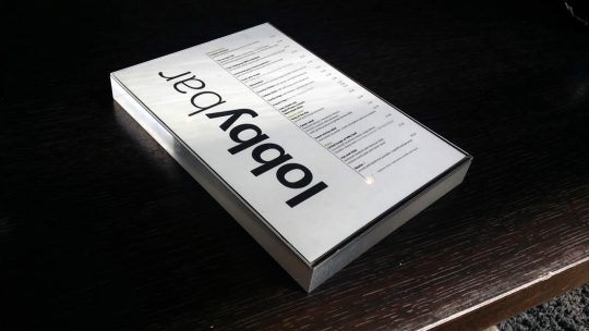
The restaurant embeds their menus in a very heavy block of transparent plastic. (Imagine a brick made out of Lucite, Perspex, or Plexiglass.)
There are no doubt practical reasons for this choice – keeping the menus clean, preventing them from blowing off outside tables, and so on.
But, there’s some psychology in this practice, too. A 2010 study found that “haptic sensations” affected how subjects perceived content.
Specifically, the scientists had subjects evaluate a job candidate by viewing a resume either on a light clipboard or a heavy one. The subjects who had the heavy clipboards rated the applicant as “better overall” and as “displaying more serious interest in the position.”
It’s not a big leap to think that a menu in a heavy block of plastic might add some “weight” to its offerings compared to a thin piece of paper.
Go for Gravitas

While the transparent block is a bit unusual, many expensive restaurants do place their menus in large, heavy covers that often resemble leather-bound folios. Both the weight and the tactile aspects of expensive materials may carry over to the perception of the menu offerings and their prices.
Paper: The Haptic Advantage
The haptic effects of physical materials may be one explanation of why paper content is often more emotionally impactful than digital content. (See Does Paper Outweigh Digital?)
In these days when most business proposals and similar documents are transmitted electronically, there could be an advantage in presenting the old-fashioned way. In my earlier article, I suggest a few ways to use this research:
1. A heavier document will create a more serious impression than a lighter one.
2. Since tactile sensations so clearly influence our subconscious perceptions, other characteristics of a printed piece – rigidity, texture, embossing, die cuts, etc. can all have an effect.
3. If you can’t afford a heavy printed piece, have the reader hold a brick while viewing your information. (That’s a joke, but only because handing a sales prospect a brick might seem a bit strange. The experiments show that even an unrelated tactile sensation can influence behavior.)
 Business cards normally weigh next to nothing. But, the card I describe in Sensory Marketing in a Business Card embodies both weight and unusual tactile sensations – it’s made from unusually thick card stock and has embossing on the bottom that isn’t visible on the top.
So, don’t be afraid to add some weight to your own persuasive content.
And the Burger Itself?
The burger, by the way, was delicious. And the accompanying fries were excellent.
Even on the latter, the hotel did a bit of priming – the rectangular container the fries were served in set high expectations by using all four sides to describe how the potatoes were sourced and other facts to make a simple product seem special.
And, of course, we know expectations influence the actual experience.
Apparently, all this priming worked – on me, at least! Clever neuromarketers, those Dutch, even if they do serve mayonnaise with french fries…
Related: The Neuromarketing of Burgers
