Confused Customers Cut Conversions
For ecommerce conversions, confused customers are never a good thing. A confused customer will be slow to order and quick to leave in search of a more straightforward process.

Although I consider myself a savvy online shopper, I’ve just gone through the most confusion-laden process that I can recall. I spent hours on ecommerce sites, review sites, and online communities and still came away with a lot of uncertainty.
This was a customer experience nightmare.
Oddly, my engagement metrics were probably off the chart for many of the sites I visited. Scrolling, pageviews, time on site, repeat visits, and other measures surely indicated a serious buyer. (The sites must agree, since I’m still seeing plenty of retargeted ads.)
The one metric that pointed in the opposite direction, though, was the important one: I failed to convert.
I left a trail of merchandise in abandoned shopping carts behind me. On multiple occasions I almost bought an item, but couldn’t pull the trigger with confidence.
Here’s the most frustrating part: if just one of those sites had eliminated my confusion, I would have happily clicked the “check out” button and moved on to more productive tasks.
Case study: how confused customers cut conversions, and what you can do about it. #CRO Share on XSo what product caused this CX disaster?
Welcome to the world of carry-on luggage.
The Dilemma
A few months ago, Wall Street Journal writer Scott McCartney posed this simple question:
Today’s riddle: When is 22 inches not 22 inches?
His answer was, “On a plane.”
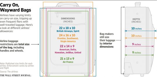
McCartney’s informative article dove into the fluid world of airline carry-on restrictions, where nothing is as it seems. He illustrated airline requirement inconsistencies with this diagram:

McCartney’s article clearly struck a nerve, as it generated more than 300 comments and thousands of social shares.
My own research took me even further down that rabbit hole. It wasn’t pretty.
Luggage, by and large, is a fashion item. Most consumers decide on a size (say, carry-on vs. checked) and buy one that they wouldn’t mind being seen with in an airport. This should be mostly a “System 1” decision, i.e., one made without a lot of conscious analysis.
Now, Neuromarketing readers who saw my laptop bag article know I’m a travel geek with a slightly (?) obsessive nature when it comes to luggage. For me, buying luggage is almost certainly going to be a System 2 decision involving lots of research and comparisons.
Fortunately for luggage sellers, I’m not typical.
But, what’s the one performance characteristic that even a casual shopper would look for in a carry-on suitcase? While individuals may vary in their preferences for price range, durability, brand image, and appearance, the typical shopper expects a “carry-on” bag to be compliant with major airline rules.
It’s not a carry-on if you can’t carry it on, right? It seems so simple.
Real Complexity
 Unfortunately, the “Can I carry it on?” question gets complicated because of airline rules and enforcement methods:
- Each airline sets its own precise dimensions for allowable bags.
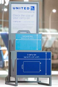
- The airline’s “sizer” devices in airports vary in actual dimensions. These variations mean that a bag that fits United’s 22″ sizer may not fit Delta’s or American’s 22″ sizer.
- Metric/English equivalents vary: 22″ means 56cm for United, but Lufthansa’s 55cm is usually converted to 22″ as well.
- Regional variations are important: US airlines tend to allow taller bags, European airlines seem to prefer shorter and wider.
- Sizer enforcement varies tremendously, so in many cases non-compliant bags fly with no problem.
- Airline staff my impose their own sizing rules, e.g., no pushing to help a bag fit.
- Carry-on bags that don’t quite fit airline sizers actually fit typical overhead bins. Meanwhile, sizer-compliant bags may not fit in overhead bins on smaller planes.
These are all real issues that can create confusion for both luggage designers and their ultimate customers.
Needless Confusion
The perplexing and inconsistent landscape created by the airlines clearly makes life difficult for both flyers and luggage sellers.
Logically, one would expect luggage vendors, whether manufacturers or resellers, to do their best to eliminate confusion in order to maximize sales.
Instead, almost all add to the uncertainty:
- Manufacturers usually publish one set of dimensions, often for the suitcase interior. These measurements do not correspond to total exterior dimensions or sizer compliance.
- Even “exterior” dimensions may not include wheels, handles, etc., which, of course, must actually fit in the airport sizer.
- In some cases, even when luggage sellers list exterior dimensions they can be inaccurate (based on customer measurements and sizer tests).
- Descriptions often include vague statements like, “fits most overhead bins.” That’s not useful information, since the bag may still be denied due to sizer non-compliance.
- Bags are sometimes described as “domestic” or “international,” which doesn’t indicate whether the bag will work for any particular airline. Some “domestic” bags, for example, don’t appear compliant with any major US airline. “International” bags often comply with the rules of a limited subset of European airlines and no US airline.
In short, except for providing a false sense of security by describing a bag as an “international carry-on” or saying it “fits most bins,” most luggage makers do nothing to reduce customer confusion.

Consumer Reports did an entire piece on this aspect of the problem: When Carry-On Luggage Isn’t Carry-On Size. In another piece, they offer this advice:
First rule of thumb: Ignore hang tags, advertisements, and website product descriptions that proclaim something like “Official Carry-On Size.” Even crazier: Ignore the stated measurements.
When the most respected consumer testing agency tells your customers to ignore your product specifications, you’ve got a problem.
I thought asking one manufacturer directly might be worth a try. I contacted Delsey, maker of the bag I’ve logged hundreds of thousands of miles with, via their website contact form. Apparently, they are in no hurry to eliminate confusion:
Seriously? I’m ready to press Amazon’s “Buy with 1-click” button, and they’ll get back to me in 2-3 days? Or, if it’s Thursday or Friday, sometime next week? That’s a little too much delay in gratification for today’s shopper. (In fact, a week later I had not received a reply.)
Crowd Wisdom?
In my own evaluation of different carry-ons, I was forced to crowd-source information. Reading reviews and answers to questions at Amazon helped a bit, but often the information wasn’t quite precise. “I’ve never had to check this bag” isn’t the same as, “I placed it in the sizer and it fit all three dimensions with room to spare.”
Amazon allows customers to ask questions about products. Perhaps the most common question I saw was a variation of, “What are the real dimensions of this bag?”
The best source was a site that wasn’t a product or ecommerce site. FlyerTalk.com is a very busy community of frequent flyers, and their members actually started several wikis to collect information on which bags fit into specific airline sizers. In some cases, members included photos showing how well (or how poorly) a particular bag fit.
The FlyerTalk information was by far the most useful, but with carry-on bag discussions made up of hundreds or thousands of posts, digging out information was tedious. And, many bags simply hadn’t been tested by members.
The real question is, why do luggage sellers do such a terrible job of describing their product that a community of flying buffs needs to create their own data repository?
The Opportunity
No doubt most consumers who go shopping for a carry-on bag end up buying one of the hundreds or thousands of products in that category. It may or may not meet the exact requirements of the airlines they fly, but it will probably work most of the time. At least, until the airlines crack down on non-compliant bags.
There’s an opportunity, though, for a luggage brand to reduce confusion surrounding their product and, in the process, steal market share from their competition.
Steal sales from your competitors by eliminating confusion. #CRO Share on XThe first step would be to publish accurate, unrounded dimensions for each piece of luggage. The interior measurements might be helpful, but what’s even more important are the total exterior dimensions. As part of the confusion-cutting, the measurements should be clearly labeled. (E.g., “Exterior, including wheels and handles.”)
This accurate data should flow through to all of the sellers – Amazon, eBags, and so on. Resellers rely on the manufacturer’s data, so confusion will be reduced through the entire channel.
The second step might entail a bit more work, but it would be well worth it in assuring customers they are making the right choice. Each item, packed normally, should be placed into the sizer (or an accurate simulator) of, say, the top ten airlines. Successful insertions as well as problems should be noted.
Each product description could then be updated with that information. For example, “Compatible with United, American, Delta, Lufthansa, KLM… sizers.” Equally helpful would be, “Did not fit Air France, Spirit…”
This would produce at least three benefits. First, consumers could immediately assess compatibility and click the “Buy” button with confidence.
Second, returns and customer dissatisfaction would be reduced by avoiding inappropriate purchases. Many reviews said the product was returned due to size inconsistencies.
An even bigger advantage would be that the testing process would no doubt reveal minor product adjustments that would increase airline compatibility. (Based on the Consumer Reports data, it seems that many luggage firms are guessing instead of testing.)
After a few hours of research, I can say with confidence that not a single luggage maker has implemented these simple steps. There are a few bright spots, though. Tumi, for example, measures the exterior dimensions including projections like wheels, and even has a data sheet showing how they do it. It’s a start.
Gear maker Tom Bihn published a lengthy blog post about United’s policies and true sizer dimensions. They then listed all of their compatible products. (Unfortunately, this great information doesn’t seem to have made it to the actual product pages where customers might see it.)
Where’s YOUR Confusion?
Most Neuromarketing readers aren’t in the luggage business. It’s a good bet, though, that at least some are in the confusion business.
Even when the confusion isn’t a deal-breaker (like not knowing if a product will work for you), it can slow the customer down and prevent them from making a quick emotional decision.
Here are a few steps that you can take to identify where confusion is causing friction and reducing conversion in your own sales effort:
- Look at customer questions. Are your customers asking questions about your product? If you see the same question or type of question popping up frequently, you should attempt to answer it in your product description. For every customer that takes the time to ask a question, many more simply left and shopped somewhere else.
- Read your reviews. It’s not a new strategy to read reviews to find areas where product improvements are needed, but in some cases you’ll also see ways to improve the product description and specifications. If one reviewer was confused, no doubt many more buyers and potential buyers were as well.
- Analyze your returns. If you find non-defective products being returned because they weren’t right for the customer’s need, that’s probably a clue that your description lacked clarity or omitted important information.
- Measure customer behavior. Tools like eye-tracking, mouse-tracking, and behavior analytics will show where customers are slowing down (or stopping). Actual user testing (live or video) may also reveal where confusion slows progress toward the customer’s goal. UserTesting.com has lots of confusion-based conversion-killer examples, including this StubHub case study.
- Study abandonment points. If your checkout process has multiple steps, confusion can cause customers to drop out partway through. That’s why smart ecommerce operators include messaging like, “You’ll be able to review your order before your card is charged.” That gives uncertain customers the confidence to click “Continue” and move to the next step.
Eliminating confusion often requires only minor design or copy changes, making it one of the cheapest things you can do to increase conversion.
Better customer experience, more sales… what’s not to like?
Reducing confusion is one of the cheapest ways to boost conversion. #CRO Share on X
