Top 10 Profile Photo and Portrait Hacks Based on Science
Are you planning to shoot a new profile photo or publicity headshot? Or, are you trying to choose the best image from a group of possible shots? There’s some surprising science to help you plan your shoot and pick a winner.
The best thing about these tips is that their effect is almost always non-conscious. The viewer won’t consciously realize that your photo appears more trustworthy or more attractive because of the content or composition. And, your photographer probably doesn’t know most of them.
1. Profile Photo Lessons from da Vinci
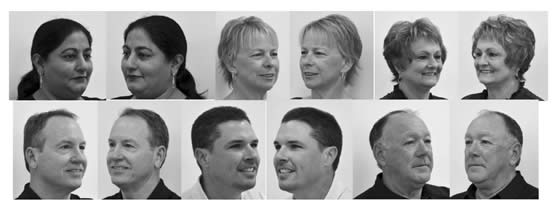
Unless you are obsessive about art and portraiture, you probably never noticed that for centuries artists have preferred to show the left side of their subjects’ faces.
One compilation of studies showed that for female subjects the bias ran as high as 78%. Male portraits were less skewed, but still showed at least a 56% bias toward the left side.
Scientists at Wake Forest University conducted a series of experiments that showed both conscious and non-conscious preference for images showing the left side of the subject’s face. The left-side preference was true both for verbal statements of preference as well as unconscious pupil dilation.
What’s going on? Our faces and expressions aren’t perfectly symmetrical, and part of the reason is that our right and left brain hemispheres don’t have identical functions. The right hemisphere controls the left side of our body and is also associated more with emotion. The conclusion of most scientists who have looked at the preference for left-side images is that the left side of our faces expresses more emotion.
One reason artists have chosen to portray men from the right side more often than women is that the less emotional right side may perceived as higher in dominance and self-control. Another study looked specifically at drawings by Leonardo da Vinci and found that subjects portrayed by right-side images were considered more “potent” and “active.”
Recommendation. Unless you feel a need to project self-control and power, use an image that emphasizes the left side of your face. It will make you slightly more attractive and, perhaps, approachable.
Study: one side of your face makes you look better. #Neuromarketing pic.twitter.com/6pAgM0X9qr Share on X2. Keep Your Eye On Your Eyes
Want to be more attractive and trustworthy, at least in your profile photo? An image with larger pupils will do the trick.
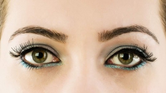
Subjects were asked to rate a video image of a person for trust. Unbeknownst to the subjects, the researchers digitally modified the size of the pupils of the person on the screen. Not only did the subjects rate that person as more trustworthy when that person’s pupils were larger, the subjects’ own pupils dilated to match the screen image.
Photo shoot lighting is often working against you from a pupil-size standpoint, as bright lights cause your pupils to shrink. So do pre-flashes for red-eye prevention.
Recommendation. When it comes to pupils, bigger is better. To increase trust, bump up the size of your pupils in your profile photo. Your photographer may be able to reduce the tiny pupil effect with low level modeling lights. Or, do what the scientists did – enlarge the pupils with digital editing tools.
Top 10 ways to hack your profile photo, based on science. #Neuromarketing pic.twitter.com/6pAgM0X9qr Share on X3. What’s a Limbal Ring?
If you aren’t an opthamalogist or Jeopardy champion, you may not know what the limbal ring is. In fact, it’s the dark edge around the perimeter of your eye’s iris that forms the border with the white surrounding area. Another set of experiments (also described in Eyes Are The Door to Trust. Attractiveness, Too), showed that a thicker limbal ring made people more attractive to viewers of the opposite gender. The scientists postulated that a thicker limbal ring is a marker for youth and health.
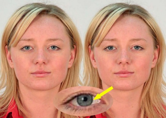
Recommendation.While you’ve got Photoshop open to tweak your pupil sizes, consider enhancing your limbal ring. It might make your profile photo bit more attractive.
4. Can You Say Cheese?
Should you smile for your profile photo? Would a serious expression be better?
Obviously, this decision depends in part on the conscious image you want to portray. A candidate for a senior judicial position probably doesn’t want the photo to catch her in the middle of a huge guffaw. But, science can weigh in here, too.
One study by Brian Knutson looked at how the expression of the person in a photo affected perception of “dominance” and “affiliation.” These are two metrics used by psychologists interested in social organization. Affiliation is a positive characteristic, indicating factors like friendliness, openness, and a need to interact with others.
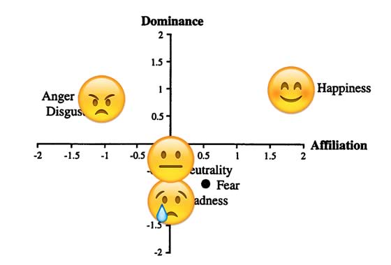
Smiling images ranked high for both dominance and affiliation. That’s likely the quadrant most of us want to be in when viewed by potential customers, business partners, and so on. Images in which the subject showed anger or disgust also scored high for dominance but were low on affiliation. While such obvious displays of negative emotion aren’t common in headshots or social media images, a very stern/serious image would likely show similar characteristics.
Most of us wouldn’t choose a profile picture showing sadness or fear. Knutson’s work shows why: images with these emotions scored low both on dominance and affiliation.
Recommendation. Include a confident smile in your profile photo. By increasing your dominance and affiliation levels, you will seem like the kind of person others should connect to.
5. Trust Me, I’m Smiling
Smiling profile images are also good for trust. As I described in Unconscious Trust Formed in Milliseconds, research by Nikolaas Oosterhof and Alexander Todorov at Princeton showed a face with smiling mouth and slightly surprised eyebrows was found to be more trustworthy than neutral or scowling faces.
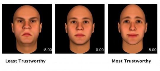
That post also references research on first impressions. While we form them in milliseconds, they can be surprisingly slow to change once formed.
Recommendation. If building trust is your goal, a small smile on your profile photo may be more effective than a big one. And, check your eyebrows. A look of slight surprise will curve them a bit to further maximize trust.
Research: smiling increases attractiveness and trust. #Neuromarketing pic.twitter.com/fsnaCAXBAD Share on X6. Get Smart
Being seen as smart is usually desirable, and it turns out you can influence your perceived intelligence with your profile picture too. Once again, the answer is smiling. A 2014 study found,
Faces that are perceived as highly intelligent are rather prolonged with a broader distance between the eyes, a larger nose, a slight upturn to the corners of the mouth, and a sharper, pointing, less rounded chin.
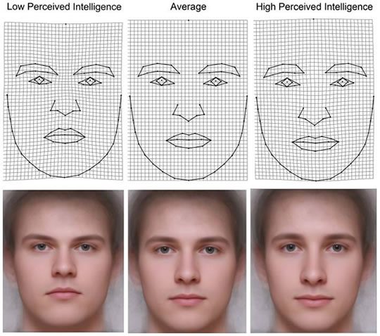
While some of these facial characteristics are out of your control, a small smile is easily achieved.
One odd finding of this study was that viewers could actually predict the intelligence of male subjects from their photos, while for female subjects there was no correlation between predicted intelligence and actual IQ.
Recommendation. A small smile might make you seem smarter (and, as noted above, more trustworthy), while a bigger smile might boost your dominance and friendliness. Dial your smile up or down depending on the impression you are trying to make.
7. When Guys Shouldn’t Smile
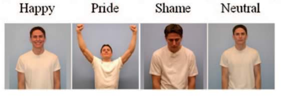
There’s one domain where smiles work for women, but not for men – sexual attraction. One study, amusingly titled Happy Guys Finish Last, had subjects of one gender view photos of the other gender. The photos displayed different emotions. The subjects then rated how attractive the pictured people were.
While happiness was the most attractive emotion for photos of women being viewed by men, it was one of the least attractive for men being viewed by women. Oddly, perhaps, shame and pride were almost equally attractive male emotions.
Recommendation. While smiles are almost always a positive for profile photos, men whose interests include dating should tone down the happy smile. Better yet, save the open smile for professional sites like LinkedIn and experiment with less happy imagery on dating sites. Women can smile regardless of their professional or personal objectives.
8. Look at Me!
Have you ever had a photographer tell you to look at something other than the camera? Her hand, perhaps, or a distant object? This may make for an artistic photo, but might not be your best profile picture choice. Scientists in the UK and Australia found that a direct gaze was most attractive.
Viewers preferred photos in which the subject looked directly at the camera and rated those subjects as more attractive. This bias for direct vs. averted gaze photos held both for attractive subjects and less attractive subjects. (I’m imagining an ad in the campus newspaper that said, “Unattractive people needed for psychology experiment. Apply with photo.”)
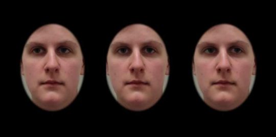
The researchers attributed the direct gaze as a social cue indicating a desire to connect with the viewer.
Where should your eyes be looking in your profile photo? Science tells you. Share on XRecommendation. Unless you’ve got a good reason to be gazing in another direction, look into the camera. You’ll be more attractive, regardless of how gorgeous/handsome you are. Or aren’t.
9. Cocktail Hour Photo Shoot?
This study result may surprise you. Researchers took photographs of subjects under three conditions of alcohol consumption: none at all, a low dose, and a high dose. (To be clear, it was the subjects consuming the alcohol, not the researchers. As far as we know.) The scientists then had other subjects evaluate the photos and rate the individual portrayed for attractiveness.
Surprisingly, the subjects who consumed a modest amount of alcohol received the highest attractiveness ratings. The high dose alcohol subjects were the least attractive.
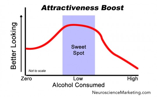
Why does having a drink make you more attractive? The researchers speculated that the subjects might be slightly more relaxed, or that a facial flush added a bit of robust color to their image.
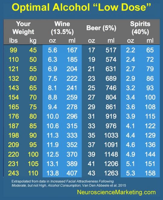
The right dose is an important factor, obviously, and depends on the weight of the individual. For more discussion, see Want to Be More Attractive? Science Says Have a Drink.
Recommendation. If you don’t have a problem with an occasional adult beverage, consider a “low dose” before your next photo shoot. Don’t overdo it, of course – check the chart below to get your optimal amount, and read my original post for more details.
10. Don’t be an Idiot
Science gives, and it takes away. Now that you have permission to savor that glass of pinot noir before your next photo shoot, I’m going to give you the negative side of alcohol as it relates to your profile pic.
Your are likely a fun-loving person who lives life to the fullest. So, why not show that you aren’t 24/7 business by toasting your profile viewers with a nice glass of wine? In fact, you are better off drinking that beverage than using it in a profile photo.
In my Forbes piece, Proof: Alcohol Makes You (Look) Dumb, I describe a study showed that subjects who viewed identical photos of people with and without alcohol rated the former as lower in intelligence.

The authors of the original study termed this phenomenon as the “Imbibing Idiot Bias.” They think that viewers associate alcohol with cognitive impairment. Even in the absence of any impaired behavior or even consumption, the cognitive damage contained in the glass transfers to its hapless holder.
Save the image of you enjoying a margarita in an amazing oceanfront cafe for your Facebook friends. Keep your profile pictures alcohol-free, unless you are a professional sommelier, micro-brewery founder, or have a similar reason to display your adult beverage savvy.
Bonus! 11. Model the Emotion You Want to Generate
We’ve already heard about the advantages of smiling. But, perhaps you want your viewers to experience a particular emotion. Maybe you want to make them angry, as many politicians strive to do with voters. In that case, a photo with that same emotion can have that effect.
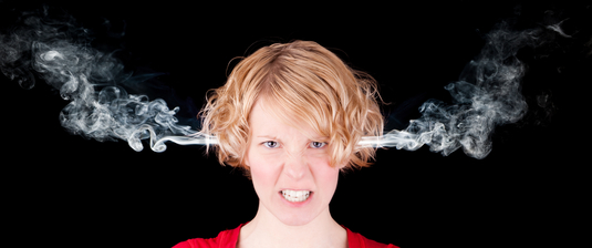
A study in Sweden exposed subjects to very brief images of face icons with different expressions – happy, neutral, and angry. The images were shown for only 30 milliseconds, too slow to be consciously processed by the subjects. Nevertheless, the facial muscles of the subjects contracted to mimic the emotion they saw.
We know from work by Ekman and others that our facial muscles can change our emotional state to match, so getting a viewer’s face to scrunch in anger will tend to make them more angry than before.
The study also shows the surprising power of non-conscious image processing.
Recommendation. If you are trying to create a particular emotion in your viewers, wear a matching expression in your own photo to invoke the facial mimicry effect.
Top 10 ways to hack your profile photo, based on science. #Neuromarketing pic.twitter.com/6pAgM0X9qr Share on XYour social profile photo or publicity headshot makes a bigger difference than you might expect. Take the time to optimize the details, and you’ll impress your viewers in the way you want and your business needs.


