Art, The Golden Mean, and The Brain
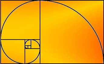
 What do mathematicians, architects, sculptors, biologists, and graphic designers have in common? They all use what is perhaps the most interesting number in mathematics: the Golden Mean, also called the Golden Ratio and the Golden Section. Approximated as 1.618, the Golden Mean plays a prominent role in math, science, and art. Mathematicians know it as “phi” – the ratio between number pairs in the Fibonacci series. Biologists find it in the proportions of Nautilus shells and leaves. Architects, painters, and sculptors have incorporated the ratio into their works because it seems to impart a pleasing balance. The facade of the Parthenon, considered to be one of the most perfectly proportioned buildings in history, matches the Golden Ratio. The frequency with which this number seems to pop up in such disparate areas may strike some as surprising, or even a bit spooky. Now, neuroscientists are starting to unravel at least a piece of the mystery using fMRI brain scans:
Cinzia Di Dio, Emiliano Macaluso and Giacomo Rizzolatti… used fMRI scans to study the neural activity in subjects with no knowledge of art criticism, who were shown images of Classical and Renaissance sculptures. The ‘objective’ perspective was examined by contrasting images of Classical and Renaissance sculptures of canonical proportions, with images of the same sculptures whose proportions were altered to create a comparable degraded aesthetic value. In terms of brain activations, this comparison showed that the presence of the “golden ratio” in the original material activated specific sets of cortical neurons as well as (crucially) the insula, a structure mediating emotions. [Emphasis added; from Science DaIs The Beauty Of A Sculpture In The Brain Of The Beholder?
The researchers also found that the viewer’s emotions (presumably based on experience and associations) also played a role in assessing beauty. Hence, a particular viewer may find a piece of art beautiful for subjective reasons even if it doesn’t match the hardwired criteria for beauty. The authors speculate, though, that such artwork may have short-lived appeal.
From a neuromarketing standpoint, it’s interesting to know that a positive response to specifically proportioned shapes is built into our brains. That doesn’t mean that every element in every ad should have a width to height ratio of 1.618. In some cases, deliberate deviations may have greater impact; ads aren’t intended to be timeless works of art. Subject matter and available space may impose other dimensions. Nevertheless, graphic designers and commercial artists should be aware of our brains’ preference for this proportion and use it when appropriate.
