Complete Neuro-Ranking of 2008 Super Bowl Ads

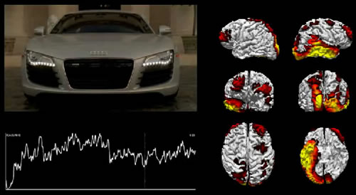
Yesterday, I commented on Advertising Age’s 2008 Super Bowl ad coverage that included neuromarketing firm Sands Research and their EEG-based ad analysis (see Your Brain on Super Bowl Ads.) Sands has actually published a ranking of every single 2008 Super Bowl commercial based on the cumulative level of brain activation by each ad as measured by their EEG equipment. The ads which scored the highest and lowest are:
1. Pepsi – “Bob’s House”
2. Coke – “Balloons” (aka “It’s Mine”)
3. Bud Light – “Power to Fly”
4. Audi – “R8” (Godfather satire)
5. Verizon – “Voyager”
…
55. Semi-Pro – Trailer
56. Bud Light – “Wine & Cheese”
57. Ice Breakers – “Carmen Electra”
58. G2 – “Jeter”
59. Anti-Drug – “Dealer”
Of course, there should be a giant “caution” sign posted with these rankings. First, Sands don’t attempt to analyze, as far as I can tell, what kind of activation is occurring. Would American Idol work as a competition if the contestants were ranked based on volume over time? Second, and more important, is that we don’t know what type or level of activation relates to consumer behavior. As I noted in my earlier post, GoDaddy fared poorly from a brain activity standpoint but apparently drove the desired boatload of traffic to their website. Once you get past these major limitations, though, it really is fascinating to see what’s happening in a viewer’s brain in real time and matched to the progression of the commercial. Check the Sands Research website to view videos of some of the ads that match brain activity viewed from various angles to the video of the commercial.
Each video is interesting. The Audi R8 commercial which satirized the iconic “horse head” scene from The Godfather seemed to produce lots of brain activity through its entire length, particularly before the revelation of what was under the sheets. (It would be interesting to compare the difference between viewers who had seen the film and those who hadn’t; I’d guess the latter might be slightly puzzled by the lengthy setup and wouldn’t light up nearly as much.) Another interesting point was the apparent high level of brain activity stimulated at the beginning of the Bud Light “Flying” spot just by closeups of the very recognizable brand and bottle. The parade balloon Coke bottle didn’t seem quite as powerful in the “It’s Mine” spot, but that was clearly not a real bottle. By comparison, the Bud Light bottle was portrayed as chilled and ready to drink.
Viewing some of these fascinating videos, I have to believe that it won’t be long before we start understanding what those flickering colors really mean to advertisers.
