Most Immersive Outdoor Ad Ever

13

Caribou Coffee Bus Shelter

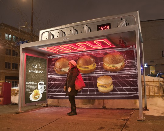
Does all outdoor advertising have to be two dimensional and boring? Ad agency Colley+McVoy and Caribou Coffee show that’s not the case with an ad concept that really puts consumers next to the product. Or, at least the consumers will FEEL like they are next to the product being promoted, a line of new hot breakfast sandwiches. The agency designed bus shelters that look like ovens, right down to an actual heating element in the ceiling. And, since the campaign is running in chilly Minneapolis, commuters will appreciate the warmth.

This design has to be one of the most immersive outdoor ads ever, at least for those commuters and passers-by who step into it. And even for drive-by traffic, the oven-like design is eye-catching and immediately decipherable. While the Caribou branding isn’t overwhelming, I think most viewers would be intrigued enough to look closely or even ask someone else. I’m confident that if anyone asked a commuter who had used this shelter, “What’s new at Caribou Coffee?” they would know the answer. One other subtle message: by showing an oven with a heating element, they are communicating that the new sandwiches aren’t microwave-heated. Overall, a highly creative and effective ad!
[Via AdRants]

13 Comments
  1. Yancy Thigpen says

    I don’t know how comfortable a Jewish person would be wait for a bus there. (Comment left by a Jewish person).

    1. Roger Dooley says

      I actually considered that, Yancy, but thought the concern would be remote. It will be interesting to see what others think.

      Roger

  2. ITNose says

    Just add the smell for total multi-sensory experience!

    1. Roger Dooley says

      I agree, ITNose! Adding an aroma of baking bread, maybe with a bit of frying bacon, and the experience would have been even more complete!

      Roger

  3. Aurelius Tjin says

    That is an excellent idea! It’s definitely not just learning about the product but actually feeling it. 3-D posters, 3-D billboards, live billboards and interactive walkthrough’s…these are more exciting ads that will definitely increase sales.

  4. HDSGNWRKS says

    Outstanding job…I know cost can be an issue, however it is refreshing to see companies take a risk on displays that will no doubt stir-up water cooler conversations.

  5. Brendon B Clark says

    I agree with ITNose, the smell would be fabulous.

    I also thought it would be cool if they could play background cafe noise, so you’d really feel like you’d stepped into one of their cafes. Could be a good opportunity to get the brand name mentioned while you waited too.

  6. XYZ says

    i’m sure with a windshield of minus 18 not even a jewish person would mind when there is actually warmth coming out of the heating element… Just guessing…

  7. marquis says

    Never seen an ad like it. Very original

  8. Midhun Manmadhan says

    I just love the concept. I would actually ‘feel’ the hear even if the coils above were not emitting any heat because of the way the shelter has been designed. I wonder what additional cost would have been involved. It’s worth it in any case.

  9. Jay says

    Endless creativity, i like the whole concept.

  10. Nisha Krishnan says

    I think this brilliant!where a certain immediate need of a person is blended in with the concept!!

  11. Truckside Advertising says

    This AD was reminiscent of the AD campaign for Milk where they used the smell of cookies at bus stops, but in this case they used a different sense, the sense of touch.

Leave A Reply

Your email address will not be published.