Puzzling Billboards
In past posts like Puzzles Boost Brand Recognition and Marketing to the Infovore, I discussed how letting a viewer solve a little puzzle might provide a little reward in the brain and help the viewer remember the product or the brand. My post about Schick’s shrubbery trimmer got me thinking about puzzle marketing again, and brought to mind what would seem to be the most unlikely venue for confronting a customer with a puzzle: billboards.
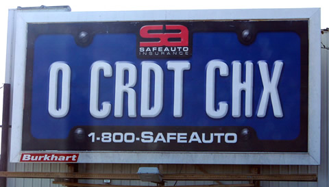
The classic advice for billboard design is to keep it minimal. As drivers flash by in their cars, they don’t have time to read text, and, of course, the more text you put on the billboard the smaller the type size must be. The idea of incorporating enough of a puzzle to produce any kind of “aha!” reaction seems outlandish. But is it? Check out these billboards I spotted in Indiana recently:

While this barely qualifies as a puzzle, it will take at least a bit of deciphering. There’s a plus, too – not only is there the mild “aha!” effect, but the use of text-message abbreviations lets the designer actually use very large type, allowing excellent visibility and quick retention by passing drivers. As an alternative to “No Credit Checks!” I think this 1-800-SAFEAUTO billboard works well.
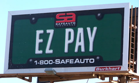
Here’s another one that has somewhat less of a puzzle payload but still makes good use of the billboard space to convey a simple message:

My favorite one in the series unfortunately got removed before I could capture it – it was something like STA LGL (Stay Legal) which required the most thought (though still not much) to read.
