Riddle: When Is Twitter Like an Elevator?
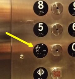
 Travel enough, and you encounter a lot of elevators. This simple device can offer some interesting user experience lessons. Some are bizarre ones, like the incomprehensible control system I described in Don’t Redesign Your Elevator! The other day, in a perfectly fine Southern California hotel, I found elevators whose control panels all showed a virtually identical wear pattern. In every one of the four different elevators, the white paint was rubbed off the “L” marking the Lobby floor.
User wear patterns on buttons are common enough, and the lobby floor is pushed by just about everyone riding from a higher floor, but the “L” wasn’t part of a button. It was just a character next to the real button. So why was the paint worn off of the “L” in each elevator? I suppose one could attribute it to terrible aim by near-sighted elevator riders, but there’s a simpler explanation: the floor indicators looked more like buttons than the actual buttons you were supposed to press! The floors are raised letters, painted white, in the middle of a black circle. The little black circles contrast nicely with the shiny stainless steel background, looking very much like buttons.
The real buttons, meanwhile, are stainless steel circles of similar size that are camouflaged perfectly by the matching panel material. Is it any wonder that thousands of elevator riders, barely glancing at the controls, first try to push the obvious black button marked with their floor? When there’s no give or tactile feedback, of course, they quickly locate the correct button. Not a big deal in terms of lost time, and a periodic dab of paint on the Lobby indicator would correct the minor appearance problem. Of course, some minor design changes could prevent the problem completely.
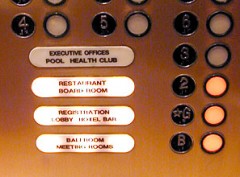
 I found a slightly different example at Gallery of the Absurd – in this case, the elevator includes a huge, illuminated button that proves to be a decoy if you try to press it. In fact, the rider is offered three choices – the large button with text labels (does nothing), a black button with the floor number (does nothing), and the real but unmarked button. (Unlike the controls I encountered, these buttons are at least made from a contrasting material.) How many distracted riders get it right the first time? (There are some other amusing examples of ergonomic failures at G.O.A.T. – check them out if you need a chuckle.)
The Ups and Downs of Twitter
I wasn’t going to post this minor user experience failure – we encounter these every day… doors with pull-handles that one must push… cabinets with surfaces unblemished by handles, or any other visible means of opening them… Usability expert Don Norman could probably find a dozen in the room you are in right now!
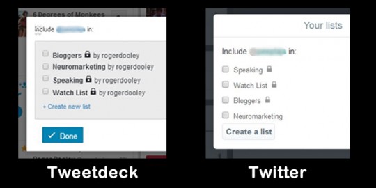
Then it occurred to me that this elevator was a lot like a Twitter flaw that caught me far more times than the silly elevator button. Take a look at these two “Add to list” interfaces:

The left one is from Tweetdeck, a tool owned by Twitter. The right one is on the browser interface of Twitter.com. While they look similar, they are functionally very different.
Tweetdeck follows the expected user interface: select the list or lists using the checkbox, and click the submit button (with text that reads “Done” in this case).
Twitter.com is another story – check off a list or two, click that button… and you get a dialog to create a new list! Huh? In fact, to add someone to a list on Twitter.com, you can check the box and simply close the window. No submit button required. This may seem simple, but it doesn’t follow the user interface employed by virtually every other form on the web.
I’ve clicked the “create a new list” button by mistake several dozen times. Each time I mentally slap myself as I close the popup. I’m sure if I used the browser interface daily, I’d learn not to do that in short order. But, I use it infrequently and am usually multi-tasking mentally and completing the form on auto-pilot.
Conversion Lessons
The mark of a good interface is that even inattentive users can complete the task without error. Both the elevator and the Twitter browser interfaces offer a false button. The elevator button does nothing, and the Twitter button launches an unexpected action. These are harmless enough. Everyone gets to the floor they want, and the perplexed folks who see the unexpected “create list” option close it and move on.
But, if you are trying to maximize conversion on your website, any false trails will decrease your conversion rate. Even if only a fraction of your users click the wrong link, or hesitate before acting because they are uncertain about what to do, your conversion rate will be reduced. To maximize conversion, be sure there is one clear path to the next step in the conversion process.
Have you encountered false buttons or other interface problems that led you astray? Do you encounter strange elevators, or is it just me? Share your experience in a comment!
