[This is a guest article by Liraz Margalit, Ph.D.]
There’s a popular new trend in website layouts that may be having the opposite effect its adopters are hoping for.
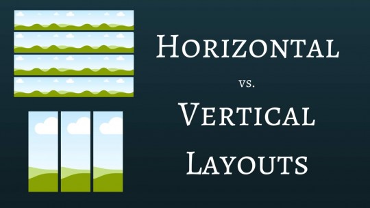
You have probably run across a new breed of sites that are moving away from the old-fashioned vertical page layout (as shown on left) towards a neat and elegant, modern looking horizontal page layout (as shown on right).
 |
 |
We are seeing this layout more and more as web designers try to stay up-to-date with what they see as important changes in the industry.
But how effective is this horizontal layout?
When one large content and information website recently unveiled its new horizontal design, I absolutely loved it.
The layout was modern and elegant, and I intuitively assumed that it would be far more engaging and successful than the previous “old fashioned” vertical layout of the page.
However, by reviewing heatmaps of customer activity before and after the transition, I discovered that I was completely mistaken.
The company’s objective is to have visitors read as many articles as possible and be exposed to large amounts of content. The site hosts no advertisements, so all metrics reflect directly on visitors’ engagement with the actual articles and content on the page.
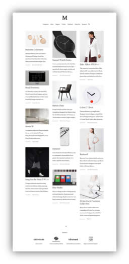
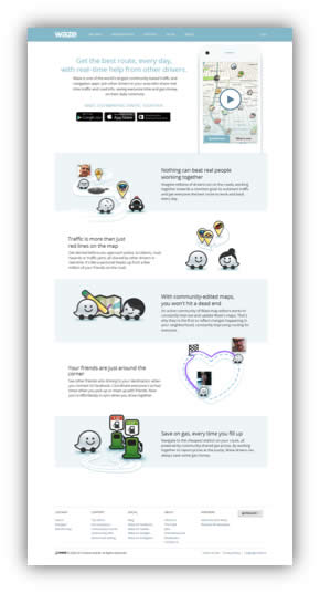
As shown below, the original homepage had laid out the articles in a long vertical list, while the new layout — displayed to 50% of traffic as part of an AB test — contained the same articles laid out horizontally.
 |
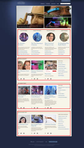 |
Interestingly, visitors were far less engaged with the new horizontal layout than they’d been with the original vertical one.
The heatmaps below show users’ mouse moves and scroll reach, revealing that visitors scrolled 34% further down on the original homepage than on the new horizontal one, and were therefore also hovering, interacting and clicking on more articles in the original layout than in the new one.
In fact, visitors were hardly even exposed to the articles that were laid out horizontally. Here’s average scroll data for the two designs:
Original vertical website layout:
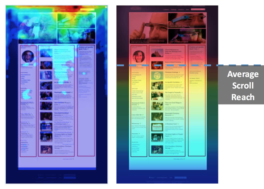
New horizontal website layout:
The Critical Importance of Engagement Metrics
There are multiple reasons why engagement metrics are of huge interest to website owners. If your objective is to maximize the exposure of your content, as in the above example, then obviously getting visitors to read, click, and explore is essential. Their time on site, pages viewed per visit, and so on will be indidcators of content consumption.
If you are selling products, those metrics will likely correlate with sales.
But, there’s a secondary impact. Most experts believe that Google uses engagement metrics (which it can access through Google Analytics, the Chrome browser, and user search behavior) as an indicator of user satisfaction. This, in turn can be one of many influences on rankings in Google search results.
Earlier this year, Similar Web‘s Roy Hinkis reported the results of a large scale study of 200,000 domains. In an article at Moz.com, Hinkis describes modest correlation between engagement metrics like time on side and pages per visit and rankings.
While correlation doesn’t prove causation, the apparent link between engagement and search rankings is one more reason to pay close attention to these metrics.
What explains the vertical/horizontal difference?
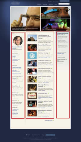
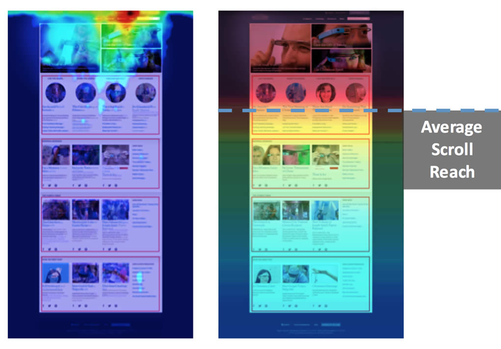
Let’s take a closer look at the two variations. Below are screenshots of the “Average Fold” for each version, showing us what visitors to the website see on their screen upon landing on the page, before scrolling down:
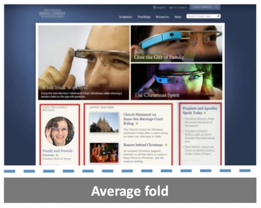
In the original vertical version, visitors received a glimpse of the columns, indicating that there is more content waiting below and a full scrolling experience to be explored.
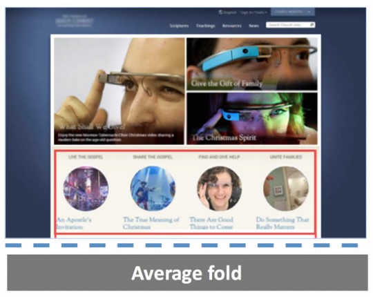
In comparison, the newer horizontal layout gives no indication that there is more content below. No doubt some visitors assume that this is the end of the page and leave the articles below hidden and unexplored.
Furthermore, even when visitors do scroll down, every horizontal row that is revealed at any point of the page could be mistaken for the end of the page, whereas a horizontal encapsulation always indicates that more content waits below.
This behavior can be explained at both an observational and a psychological level.
The example above demonstrates the difference between a vertical layout, which encourages scrolling (and thus uncovering and engaging with more content) and a horizontal layout, which doesn’t trigger scrolling.
However, the phenomenon doesn’t boil down to just the vertical or horizontal layout.
It’s directly linked to whether or not visitors to the page have an indication that more content hides below the fold.
Many other techniques exist for hinting that more content hides below the fold of the page, as explained in the psychological overview below.
Insights from Psychology
The term “Object Recognition” denotes the way we interpret the meaning of an object.
The recognition of objects is crucial for our survival, as we must identify objects before we can infer their relevant characteristics and features. Once we identify an apple, we immediately know that it is edible; once we identify a wolf, we know not to disturb it.
Our brains like to recognize patterns that have previously led to successful interactions. In How We Decide, Jonah Lehrer writes that our brains produce a pleasure-inducing neurochemical, dopamine, when we recognize familiar patterns in the world around us.
When we act on these patterns and are successful in whatever we are trying to do, we get an additional burst of this pleasing chemical.
Our recognition of objects relies mainly on their shapes. In the very early stages of recognition, our perceptual system uses information on the retina to identify the object by primitive features like lines, edges and angles.
Later stages of recognition include matching the object descriptions with the most prototypic shape definitions stored in our memory, thus constituting a top-down process in which the higher order cognitive levels flow down to lower level functions like our senses.
Only small amounts of input are required for this process to take place; our system seeks confirmation by “template matching,” allowing us to immediately identify the letter ‘B’ as part of the alphabet, and not as an abstract shape.
One of the most famous theories on how we visually perceive elements is the Gestalt Principle, a psychological concept originally introduced in the late 19th century in Germany.
“Gestalt” literally means “form” or “configuration,” and the theory of Gestalt explains that there are inherent mental laws that dictate how we visually perceive objects — specifically, the whole is greater than the sum of its parts.
For example, when we look at the figure below, we automatically interpret it as a triangle, and not 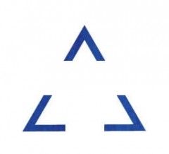 as three individual angles. This indicates that our brain first sees the overall form of an object, and only afterwards begins picking out the details.
Based on Gestalt’s “Law of Closure,” our mind tends to complete incomplete shapes and create mental objects even if only a small part of the shape is displayed. Our mind does this by ignoring gaps and completing contour lines to form shapes already represented in our minds.
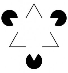
A great example of the Law of Closure is the Kanisza Triangle, seen below. This illusion, originally explored by Italian psychologist Gaetano Kanizsa in the 1950’s, demonstrates how we see two overlapping triangles even though no complete triangles are present in the image.
This phenomenon explains why the horizontal layout doesn’t work.
The horizontal box construction implies closure and a pattern more typical of the bottom of a page.
When we see the closed horizontal structure, Gestalt’s Law of Closure kicks in and we experience a complete closed shape. As a result, we do not look for more information and end up overlooking the remainder of the page.
“The only way that human beings could ever have survived as a species for as long as we have is that we’ve developed another kind of decision-making apparatus that’s capable of making very quick judgments based on very little information.”
-Malcolm Gladwell
Fixing a Horizontal Layout
Have you just launched a complete redesign using a horizontal page layout? Are you experiencing lower content engagement? Starting over may not be an option, at least in the short term.
If you are stuck with a horizontal layout, here are a few quick fixes you can try:
Eliminate Boxes and Horizontal Lines. Rectangular boxes and horizontal rules add a visual indication that the content has ended, and also use up vertical pixels that might otherwise display the next content element. Eliminating these elements and tightening up the vertical dimension of the page will increase the probability of the visitor scrolling farther.
Add a Down Arrow. To cue visitors that more content lies below. You can use one or more down arrows. You could locate one in the lower part of each content block and link it to the next block, for example.
Or, you could use a floating arrow that serves as a constant cue to keep moving.
Add a Vertical Element. Although adding a vertical content block or other vertical element may annoy those who like the purity of horizontal design, doing this could help show visitors that the page doesn’t end at their visible screen.
Many WordPress themes, for example, offer a sidebar option. Populating this sidebar with content of some type will help cue visitors to keep scrolling.
Other Problematic Layouts
The horizontal layout is just one example of website design that conflicts with our natural object recognition processes.
For example, here is a recent redesign of the Pinterest homepage:
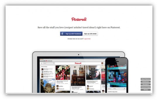
As you can see, it shows us an iPad and iPhone that are both cut off at the bottom of the page, creating the impression that the rest of the images (and potentially additional content) are hidden below the fold.
This automatically cues us to scroll down – but there is nowhere to scroll down to, leaving us frustrated and anxious.
Had the page been longer, this would’ve been an excellent way to cause visitors to scroll down, as everyone wants to see a complete shape. Pinterest has since updated the page to a very nice, sleek and dynamic look, resolving this issue.
Our minds are similarly confused when we encounter elements on a page that look clickable due to their button-like shape (ex. a small rectangle with text that looks like a call to action). When the element is not clickable and turns out to be just a simple image, we are inevitably annoyed.
We are easily capable of filling in the gaps and working out the surface meanings of elements when we understand the underlying pattern. The problem is that website interfaces often lack any visual cue indicating what patterns are being employed
Helping your visitors understand the surface meaning of your site’s elements will affect how they interact with the page and, more importantly, how they feel about it. Therefore, it is crucial that you make your visitors feel good about interacting with your products by ensuring that the surface elements can be quickly and accurately interpreted.
The way you design your interaction experiences must take into account the limitations of our cognitive systems.
The more you use established interaction design patterns on your website, the better your visitors’ understanding will be, and the more satisfying an experience they will have.