Should You Put the Price First or Last?
Should you lead with price? Or should you describe the product first, and then show the price?
There’s now an answer to this long-running marketing question, and it comes via a study using the tools of modern neuroscience.
Researchers Uma R. Karmarkar, Baba Shiv, and Brian Knutson evaluated how subjects reacted to the order in which product price and descriptive information were presented.
They studied differences at both the neural level (using fMRI) and behavioral level (by measuring purchases). They found that the order of presentation did indeed make a difference.
Should price come first or last? Brain scans reveal the answer. pic.twitter.com/XTHmzCdprO Share on XFor a lab experiment, this one was quite robust. Participants were given $40 of money to spend, and then were observed as they reacted to different offers and orders of presentation.
Every price used in the experiment was below retail, and hence represented a bargain.
After displaying the price and product information separately, they were displayed together.
The actual purchasing behavior didn’t change much based on when the price was displayed, perhaps because the products all offered a good value at the below-retail price.
What the fMRI scans found
What did vary, though, was the brain activity of the subjects. Depending on whether they saw the price first or last, different areas of the subjects’ brains were more active when they saw the combined display.
An article at Harvard Business School’s Working Knowledge by Carmen Nobel quotes Karmarkar:
The pattern of activity in the prefrontal cortex suggested to us that sequence matters: At the very simplest, the neural signals looked different when the price came first versus when the product came first.
When the product came first, the decision question seemed to be one of ‘Do I like it?’ and when the price came first, the question seemed to be ‘Is it worth it?’ [Emphasis added.]
When Prices Go First
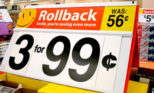
Does your product offer an excellent value? Is the price reduced, or is it less expensive than the competition?
If you want your offer to be evaluated primarily by the value it offers, put the price first. That will get the customer to focus on value more than the product details.
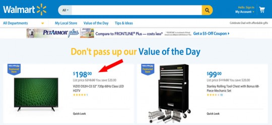
Walmart.com, a site that is always about pricing and value, exemplifies this approach. On this daily deal page, the first thing you see is the price. Not only is it first, it’s big.
The “value” aspect is further underscored by both the headline and by the small but prominent list price and savings calculation.
The overall product presentation is clearly designed to get visitors to think about the product in terms of the value it offers.
When The Product Comes First
While most marketers think their product offers a good value, it’s not always wise to make price a primary focus.
Luxury brands and upscale retailers, for example, need to focus more on the product and making it desirable. When the price and product are viewed together, the offer will be evaluated on the basis of “Do I like it?” to use Karmarkar’s words.
Tiffany.com shows us how to delay viewing of a product’s price. First, we see a gorgeous page with a rotating display of the product in an enhanced, magnified view. My still image doesn’t really capture how attractive the effect is:
That page also gives us links to watch a “heritage video” about Tiffany watches and to find out more about the “making” of this watch. Both of these are intended to make the product seem more unique and desirable.
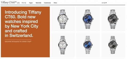
If you click to find out more about the actual products, you are taken to what at first glance looks like a typical ecommerce catalog page:
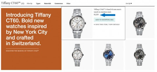
Unlike just about every other catalog page, though, this one doesn’t show prices as you browse the collection. You don’t actually see the price until you hover over a particular image:
Tiffany cleverly delays showing you the price for as long as possible. When they do show the price, it’s in small, understated type.
If you actually click through to the product page, the price is again the last item before the “buy” button and is similarly de-emphasized:
It’s as if Tiffany is saying, “We know the price isn’t particularly important when you are buying a product of this quality and heritage, but we have to tell you.”
Overall, Tiffany does a nice job in focusing on the product and delaying showing visitors the price as long as they can. Their approach is a good lesson for web retailers who think showing product information before price isn’t possible.
The only criticism I have is that Tiffany could have displayed a little more product information without requiring the visitor to click on the inconspicuous “heritage” or “making” links. A few snippets of information might serve to make the product even more desirable to someone attracted by the appearance. After seeing the images and a few sketchy product detials, I wasn’t quite sold on the idea that I might actually want this watch.
Then again, perhaps the lush visuals and desirable brand are enough for Tiffany’s target market.
What does your product offer?
This research shows that if you change the point at which the price of a product is seen, you can control the frame the consumer uses to evaluate the offer.
Are you selling value? Put the price first and make it prominent.
Selling value? Study says show customers the price first. pic.twitter.com/XTHmzCdprO Share on XIf you are selling desirability, emulate Tiffany – sell the product first, then show the price in an understated way.
Note that you can even vary the approach with individual products. You may be primarily focused on making your products seem desirable, but you may also have sale items that represent great value. Lexus never leads with price on its high-end luxury sedans, but uses price in a much more prominent way on their less expensive cars during a sale event.
A final warning
Be certain, though, that if you decide to take the price primacy approach and focus on value that the value you are offering is real. If you put customers in a pricing/value frame and fail to deliver a value they find believable, you may lose sales. The Harvard article quotes Karmarkar:
If it’s an insignificant discount, then you’re actually putting yourself at a disadvantage by highlighting the price first, because people are now cognitively scrutinizing the price and making sure it’s worth it.
You can’t just try to fool people into thinking it’s a great price.



what a great article and breakdown (as always) Roger! I love your example of Tiffany and Co “We know the price isn’t particularly important when you are buying a product of this quality and heritage, but we have to tell you.” It’s hidden in plain sight isn’t it!
Thanks for stopping by, Tim!