Child Labor: Put That Baby to Work!

The direction a baby faces in an ads changes what people look at
22

baby-1

Advertisers have known for decades that pictures of babies attract attention and hold the viewer’s gaze. That’s why you often see pictures of babies – cute, startled, smiling, frowning – in ads that have nothing at all to do with baby products. An interesting study from Australia shows what takes a baby-picture ad from merely attention-getting to effective.

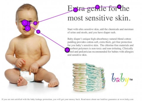
Usability specialist James Breeze conducted a study of how people view baby ads with 106 subjects (Updated link: You Look Where They Look.). He used eye-tracking technology to measure the direction and duration of the subjects’ eye movements. The image at the top of this article is the measured activity for a single user. (In each case, the subjects started viewing the ad in its center.)

When the subjects were presented an ad with the baby looking straight out of the page, the heat map below shows that viewers fixated on the baby’s face, and gave quite a bit less attention to the headling and ad copy:
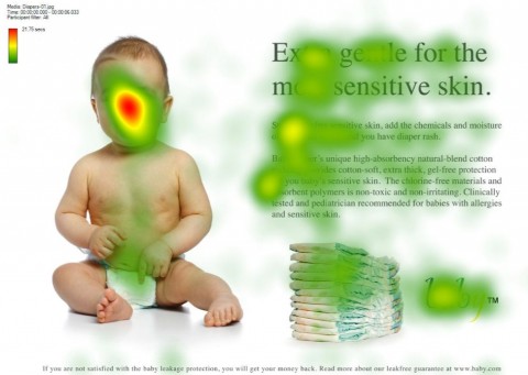
Baby Heat Map - Looking Forward

No big surprise, perhaps, but watch what happens when a side-facing baby image is positioned to “look” at the ad’s headline:
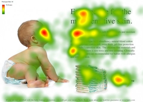
Baby Heat Map - Facing Sideways

We see that the baby’s face is still a major hot spot, but now the ad headline and copy get far more attention! Breeze concludes, “In advertising we will look at what the person we see in an ad is looking at. If they are looking out at us we will simply look back at them and not really anywhere else.”

The neuromarketing takeaway is simple: a face in your ad will attract attention, but be sure the face is looking at what you want the viewer to see!

22 Comments
  1. Scott says

    What about without the baby? Would the ad headline not remain a hot spot?

    1. Roger Dooley says

      Good point, Scott. With no baby, the headline would likely be the hottest spot. But, if the ad was in a newspaper or magazine, the text-only ad would likely be viewed less often. The baby (or face, etc.) is meant to draw the attention of a casual reader who might otherwise turn the page without more than a glance. Thanks for stopping by!

      Roger

  2. Scott says

    Right. I just thought the study seemed a little weak, or more like a follow up study than anything (once the baby conclusion had been established). Of course, rereading the first sentence and following the link tells me that the observation has been “known for decades” and I’m just showing up to the game a little late. My mistake. Thanks.

  3. Hoover says

    I see that the headline and blurb got more attention when the baby wasn’t looking directly at the viewer.

    I also see that the towels, and the logo, and the long line of text at the foot of the ad also got more attention when the baby wasn’t looking at me.

    My takeaway? Don’t use faces in advertising – they distract from the message.

    1. Roger Dooley says

      That’s the tradeoff, isn’t it, Hoover, particularly if the product isn’t a baby product. On a crowded newpaper page, the baby’s face WILL attract more eyeballs to the ad than if it was text-only, but will they pay attention to the message?

  4. Hoover says

    I’m not sure we can even say that, Roger.

    I don’t mean to appear contrarian, but I see no evidence that the baby ad attracted more attention because it had a face in (or a baby, for that matter). There wasn’t a second baby-free ad competing for attention, as far as I understand.

    And I think Mr Breeze’s conclusion that we look at what the person in an ad looks at is faulty.

    But I admit, babies are cute 🙂

    1. Roger Dooley says

      Hoover, this study didn’t address the baby vs. no baby issue. For years, though, it has been advertising wisdom that baby faces are the #1 attention-getter in print ads. I’ll see if I can find a study to support that, or perhaps a reader has a link to some good info. (Thanks for keeping me honest, I meant to do that before I published the post, but ran out of time!)

      Roger

  5. Fascinating study — and the comments before mine bring up some important questions about faces in advertising.

    I will definitely be checking out more of your site! Thanks to @copyblogger for the recommendation.

  6. Dominika says

    I would like to see a study of the ad where the baby would look the other way than ad text. Would our eye leave the ad altogether, as authors seem to suggest? Such experiment would help to verify the conclusion that we look where the face does. I wonder if pictures of puppy or kitten would attract reader’s attention as strongly and if similar rules would apply.

  7. Steen Olsen says

    We are aware of this in our business and have discussed it on more occasions… But honestly we forget to implement it thoroughly.

    In regards to the comment of NOT to use faces in advertising I disagree. I think that you just need to make the right fit and use it with care. If you have a webpage full of all kinds of content a good picture with a facial direction towards the most important piece of information would make the page lighter and point the users attention to the issue in focus. There are many other occasions where I would definitely use faces (if only I remembered to :-))

  8. alex says

    Interesting!
    From the evolutionary psychology perspective, we have very well developed neural pathways specifically for processing faces because it was important for our ancestors to be able to identify faces and understand the emotion and intent of people. People who instinctively looked at faces probably better avoided angry (dangerous)people and got more lovin’ from sexually interested others.
    But the part about pointing the face toward the text is really clever!!
    Just yesterday I was walking along and two people coming the other way both looked up at a tree. I instinctively looked up too. This study demonstrates a way to harness that instinctive response.

    Love it.

  9. Naomi Niles says

    Very interesting!

    Whenever I put a photo of a person in a design I am doing for a website, I always have it facing towards the content. Never did it for a conscious reason, it just always felt more right. Now I see why!

    1. Roger Dooley says

      You must have good instincts, Naomi. I’d guess that it’s more common to have the gaze looking outward at the viewer, and, before seeing this study, would probably have done just that.

      Roger

  10. Play Guru says

    Heat-maps are a great source of intel gathering. Great post!

  11. Scott Lovingood says

    The heatmaps do show that a baby facing the text will increase the amount of time that a person looks at the text and increases the likelihood of that person reading the small font text as well.

    The questions that I always have in these types of studies.
    1) Do they increase conversions? The goals is to get sales so do they measure conversions? Online it would be easy to track but would probably be skewed since the participants know they are in a study.

    2) Ad without image – Does it generate as much interest? In a magazine it is often assumed that the baby draws you to the page. Could they not test that as well? The first goal is to get them to look at your ad. The second goal is to get them to read it.

    So while we measure the individual parts of the sales process, we don’t have a systematic study to show the impact on the bottom line of the company. We assume that higher attention will translate into higher sales, but if we don’t measure it we will never know.

    PS If I ever put a baby in my ad, it will be looking at the call to action button 🙂

  12. Mandip Sandher says

    The real “message” is behind the content that you see at first glance. The entire image has a hidden “intelligence” or let’s say morse code message for the viewer. The question is can you decipher it!

    The same type of message that Leonardo DaVinci left in his paintings especially Mona Lisa, the same that Salvadore Dali left in his work. Life is a game with a twist, all images contain a message, we are here it discover the “hidden code” which unravels the Mystery of Life!

  13. Roy Mathers says

    The reason we look at what other people are looking comes from the activation of the “mirror neuron, the inferior frontal cortex and the superior parietal lobule.” The mirror neuron is for psychology, what rDNA is for biology.

  14. Harsh says

    Intriguing and useful.

    Roger, do you have any information on behaviour of viewer of TV or Digital Ads having babies or kids in them. Secondly, is this correlation between babies and attention dependent on age as well? Is there any age limit after which viewer becomes indifferent to these ads? Lastly, does this study mean that if we show grown ups facing the copy of the ads, then they won’t be effective ?

    Do let me know. Thanks in advance.

  15. Roger Dooley says

    Harsh, I haven’t seen that data but would assume that a baby in a TV ad would draw our attention much as in print ads. As far as an age limit, I don’t think there is one (although I don’t think that variable has been studied). Presumably, humans are programmed to find small children cute as a species survival mechanism. Human babies are vulnerable creatures, and our early human ancestors no doubt benefited from any adult being protective of any baby, vs. just having those feelings for one’s own offspring.

    Roger

  16. James Anderson says

    If I personally see a baby in a TV ad it draws my attention equally much as print ads. Recently I watched a TV ad and was that fixated on what these two little cute toddlers were doing I never even noticed what it was actually advertising. Baby feet and hands are also heavily used in baby ads which is interesting and probably one of the most photographed parts.

  17. Alan Cox says

    Roger, I have been involved in the film and TV industry all of my working life. Images in ads, blogs work.

    As a video creater, I always attempt to control where the viewer will look next. That’s why most images have the person facing into the frame and not away. Unless of course, the desired effect is one of detachment, withdrawal etc.

    The eye can be drawn down into the text using white space and punctuation. (Some of the ways to do this drive punctuation fanatics crazy) but it works. Text alone can work but images increase the chances of people actually looking at and reading the content.

    Your article confirms that what we aim to do is spot on. Thank you.

    1. Roger Dooley says

      Thanks for sharing your experience, Alan!

Leave A Reply

Your email address will not be published.