Your Brain on Thousands of Products

Last week, we saw that order of presentation of a small number of products dramatically affects consumer preference. (See Order Effect Affects Orders.) But how do our brains cope when choices number in the hundreds or thousands, and how do websites best match products or services to their visitors?
First, a warning – Neuromarketing reader participation post! I’m going to look at a few different matching/searching approaches, but I hope YOU can suggest one or two that YOU think break new ground! This post is a longish one, but if you are at all involved in website design or product/service matching systems, I hope you come away with an idea or two.
Imagine the problems faced by, say, Amazon when someone searches for televisions. They carry nearly 2,000, ranging from tiny hand-held units to massive home theater displays. Or a travel site presenting possible Chicago hotels, which number in the hundreds and vary in location, price, amenities, etc. Or an even less-well-defined matching project, like, “I want a cruise in November.”
Let’s look at a few examples of sites that have come up with different ways to attack the problem of matching/searching and then presenting the results in a way that is meaningful and comprehensive:

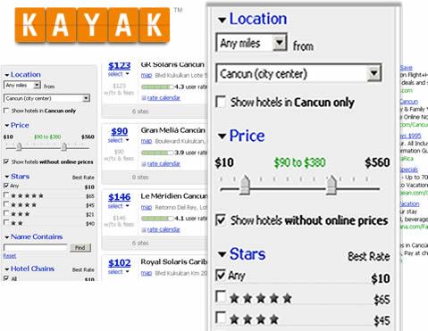
Kayak faces the dilemma of all travel sites: a large number of results for many searches, and the need to give users a way to narrow those choices to the best fits. They use a “dynamic list” approach with the controls in the left column. Their controls are diverse – range sliders, check boxes, text fields, etc. Every time a user changes a setting in the left column, the search results in the main column refresh to reflect those changes. Furthermore, they provide users with the ability to sort by several variables, including price and popularity.
Like: Easy to understand, powerful selection/winnowing, sort options
Dislike: Old-fashioned list, hard limits on choices
Amazon uses a similar interface for some kinds of searches. In the TV search below, for example, the left margin contains a variety of criteria that can be used to limit the search. Not unlike Kayak, one can also sort the displayed products in several ways.

Like: Easy to understand, good selection/winnowing, sort options
Dislike: Old-fashioned grid display, hard limits on choices
Car Matching
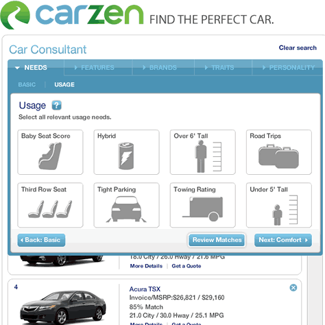
Automobile sites deal with relatively small numbers of products compared to, say, travel sites, but the magnitude of the automotive market has let to some interesting experimentation in matching buyers with a car that meets their needs. One site that I find interesting is CarZen, which uses an interview-style interface:

There are a few things to like about CarZen. First, they show results at all times during the “interview,” so you can see your choices narrowing. Second, they don’t lock you in when they don’t have to. For example, many search/match algorithms would force you to choose between an “SUV” or “sedan” body style. CarZen lets you select multiple styles, which leads to more interesting results. Third, the site lets you distinguish between a “Nice to Have” and a “Must Have” feature in some cases. Finally, CarZen gives you a percent match indication for each displayed vehicle.
Like: Degree of importance for some criteria, match percent shown in results
Dislike: Still a list
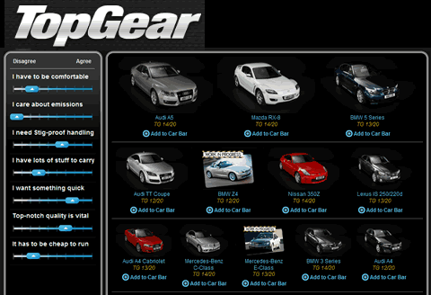
Another take on the car match process http://www.topgear.com/uk/car-chooser-launch Top Gear. This site presents the user with two quick questions about acceptable body styles and price range, and then offers a vertical column of sliders for the user to express preferences. To the right is a larger window showing the best matches. When the user moves the sliders, the right pane reshuffles to put the best matches at the top.

The Top Gear site makes good use of the sliders to establish varying levels of importance for different vehicle characteristics. The presentation of results is also interesting, as the best choices seen in the first row are clearly larger in size than the next best choices shown in the following rows. This may not be a very complicated concept, but I think emphasizing the best matches by size is inherently appealing to the user.
Like: Importance scale allows fuzzy matches, car size indicates degree of match
Dislike: No clear indication of why matches are better or worse
Real Estate
Real Estate sites face a huge challenge. Zillow.com, for example, claims to list 92 million homes, with nearly 4 million for sale. Most real estate purchases, of course, are local, which may reduce the number of potential properties to merely thousands. Here’s Trulia.com’s map display:

They feature a variety of controls on the left side to narrow the search, and homes meeting the criteria show as markers on a map. The user can hover over a marker to bring up a thumbnail picture, price, and address. Clicking will bring up more detailed information. This is a nice way to visualize a geographic search. Some travel sites display hotels in a manner like this, though usually without the excellent hover detail.
Like: Map navigation, zooming, detailed selection criteria, hover details
Dislike: No degree of importance, or fuzzy matching
Fuzzy Matching
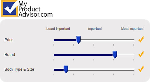
One of the key aspects of an effective matching process, in my opinion, is flexibility to let users weight the importance of a criteria and permit imperfect matches. All too often, hard limits are established as part of the selection process. A match that might fall just outside an established price range but be perfect otherwise might not be shown. Or, selecting a particular attribute that isn’t of great importance to the user (but is required by the algorithm) might downgrade or (screen out completely) a whole set of great choices. Here’s how My Product Advisor enhances their car selection process by letting users weight a few of the product characteristics they selected:

Soft Criteria
Most product search and matching systems are based on hard criteria that are easy to quantify in a database – price, screen size (TVs), exact geographic location (real estate, hotels, restaurants), body style (autos), etc. More creative (and effective, in my opinion) matching systems take into account user preferences that are a little harder to quantify but which may be important to the buyer. Top Gear does this to a limited degree with some of their sliders:

Comfort levels aren’t part of standard vehicle specifications, but rather must reflect someone’s opinion, perhaps an auto reviewer. Handling might either be a similar judgment call, or perhaps a test specification like a maximum cornering g-force.
Emotional Criteria and Proxies
I think soft criteria could get even softer, and more emotional in nature. For example, what if you could correlate various seemingly unrelated product preferences and consumer characteristics to a likely vehicle match. You consider yourself a fun person? You live in a big city? Your favorite beer is Heineken? How about a Mini Cooper or a VW Bug, if those aren’t ruled out by the hard criteria you also input (price, number of passengers, etc.)?
Incorporation of more emotional criteria or proxy questions (likes/dislikes in seemingly unrelated areas) may well be the next frontier in producing matches that represent what the user REALLY wants.
Reader Participation
Here’s where YOU get to participate – if you know of a site that has a search or match process that turns thousands of choices into results in an intuitive and fun way, post a comment with a link and why you like it. If I get some good responses, I’ll feature them in a followup post!
