20 Comments
  1. Phil Smith says

    Not that I plan to advertise in Arabic, but is it safe to infer that an audience that reads from right to left would have results inverted on that axis?

    1. Roger Dooley says

      Phil, although right-to-left languages weren’t tested in that study, it would be logical that the eye-tracking pattern would be reversed.

      Roger

  2. Walter Reynolds says

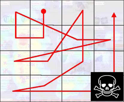
    Interesting information. My concern is the eye-tracking study mentioned was for web pages not print ads. In addition to our left to right and top to bottom reading pattern web pages have their own inherent navigational and structural characteristics that I think influence how someone scans a page. Most web pages locate the logo in the top left corner. The alley of death is typically where the paid ads show up and there usually isn’t much in the bottom right corner.

    Another factor is the purpose of the ad – is it a branding awareness ad, is it promoting a specific product or is it trying to elicit an immediate response? In some cases it may be more important for the phone number to be seen than the company’s logo.

    1. Roger Dooley says

      All good points, Walter. And clearly, a lot depends on what’s happening in the ad. I looked at some print ads that had nothing but an image and then a brand identity in the lower right. In those ads, I suspect, the logo would get more attention simply because there were just two elements on the page.

      Roger

  3. Steven says

    Roger, very interesting findings. Sometimes I’m scared about how good marketers are going to get with all this neuroscience to back them up!

  4. adam says

    Makes sense. like the recommendation. So its not the first thing, hey see, nor the last. Same go for a tvc? should the brand be in the middle or the end?

  5. David Engel says

    This is a really cool layout tip. My coolest ads have the logo at the bottom center. It just feels right in many cases.

  6. Brett Warner says

    This pretty closely mirrors best practices for ad placement in order to increase website to ad click throughs as well. Which really isn’t at all surprising.

    1. Roger Dooley says

      Some of that work was actually based on web page viewing, which fits in with your comment, Brett.

      Roger

  7. Frymaster says

    This analysis presumes that the logo ranks at the top of the value chain of the presentation. Is that _EVER_ true?

    Logo – other than telling the consumer who created message (which the consumer already knows) – are useless. Marketers slavish obsession with them frequently leads them astray. And, yes, I actually made a logo un-naturally large yesterday at the command of the client.

    When a client asked my dad to make the phone number bigger (in 1975!) he replied: nobody’s going to call you because you have a telephone.

    In conclusion, you have this perfectly backwards. Logos belong in the lower right because they add almost nothing. If the logo is, in fact, the best you’ve got to offer, then just make the ad a giant logo and be done with it. (It’s what the VP of Sales has wanted all along.)

    1. Roger Dooley says

      Good point, Frymaster. In many ads, though, the logo (or other brand identification) is the only thing that ties the ad content to the brand. Think of a typical fashion ad, for example, that consists mainly of a photo of a model wearing the product. Of course these ads don’t compare to, say, the old Absolut ads which made the brand identity (the distinctive bottle) the key focus of the ad.

      Roger

  8. sean says

    The so-called “alley of death” is actually the best place to put a form on a lead-gen landing page. Once again, non-scientific marketers take a very specific piece of scientific research and turn it into a useless generalization.

    1. Roger Dooley says

      I always recommend testing, Sean. General research can give you a starting point, but just because something worked in one limited set of circumstances it doesn’t mean you’ll get the same results.

      Roger

  9. sean says

    Roger

    I wholeheartedly agree – testing is key. I also appreciate that the kind of research undertaken for the Eyetrack III news-site project is a great place to look for inspiration for testing ideas.

    What concerns me is oversimplification of findings, and generalizations like the “alley of death”. Too often ideas like this end up being peddled as best practice by people who either ignore or do not understand the specificity of the findings.

    Anyways, by now I am about 5 screens down the page so you are prolly the only one reading. I’ll be missing my target audience who wouldn’t have bothered to scroll…

    😉

  10. Berthold says

    Actually, the corner of death is a sort of myth. It very much depends on what else is on the site, and where everything is in relation to the logo.

    It’s true that we usually read from left to right and top to bottom, but it is also true that our eyes are attracted by images without regard of where they are on the page. Images in turn are perceived differently, giving above average pull to portraits and below average pull to stock images (according to another study, people have learned to tell). Text set in a size above a variable threshold is also processed as an image, as well as pretty much anything with adequate white space. For instance a logo, which is why we always preach to leave some breathing room in the designs.

    Like I said in my comment on the article about magician tricks, it’s all about contrast. If anything, the bottom left corner could be a corner of death *if* the eyes are led down the right edge of the site and there is no visual contrast to whatever is in that corner.

  11. Dixon Jones says

    I’m not convinced.
    The logo is not a call to action, it is a trust signal. If you want to associate the logo with an emotion… be it a sense of belonging, a sense of controversy, a sense of adventure or a sense of well being, then you first need to invoke the emotion by which it stands. So on that logic, the bottom right is EXACTLY the right place for the logo if you want the user to remember the logo well after the Vine / Banner / Print Ad / Emotion has passed.
    ….In fact, I am glad I commented now. Dixon << (See? Name at the penultimate point of interaction)

    1. Roger Dooley says

      Wow, Dixon, I almost missed this comment… must have a blind spot or something. 🙂

      I think there’s also something to be said for unconventional layouts as a way of making the viewer pay attention. As with most things, my advice is to test, test, test…

      1. Dixon Jones says

        Ah – but how do you test whether a logo right or left leaves the correct lasting impression? I once saw some adverts on Bus stops in Bristol, England, for a fake perfume called “Sheila” with a picture of an Aussie hat with corks on strings and the tag line “also kills flies”. Turns out is was a test to prove the power of billboard advertising, but that’s some test! 🙂

        1. Roger Dooley says

          Hmmm… At least they didn’t go with “Smell like you’ve been in the bush…” 😉

          Actually, neuromarketing tools could be used to see which logo location caused greater recall. Even simple surveys might do the trick with a large sample size. Or a CRO test on a busy ecommerce site.

  12. Ayush Srivastava says

    Eye tracking is a game changer for market researchers.

Leave A Reply

Your email address will not be published.