How to Increase Digital Trust with an Easy Fix

If you want people to do something on your website or in your mobile app, trust is clearly important. Without “digital trust,” you won’t get their email, and you certainly won’t get their money.
If you are looking for ways to increase digital trust, you will no doubt think of traditional techniques like adding trust symbols, customer testimonials, or influencer endorsements. These are indeed useful, but the most effective solution is the “easy” one.
I put “easy” in quotes because implementing the approach isn’t always simple or fast. The remarkably powerful way to make your site (or app) trustworthy is to make the user experience (UX) easy!
Customers like “easy”
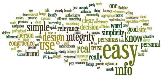
Ease of use and trust don’t seem to go hand in hand at first glance, but the data supports this linkage. Researchers at Southampton University conducted focus groups to determine why people trusted one site over another. When they analyzed the dialog, they came up with the word cloud below. Does anything pop out at first glance?

Obviously, the word “easy” dominates the cloud. A more detailed analysis of the responses showed factors that area all related to ease of use and UX:
- Simple to understand – Simplicity is key
- Clarity of approach
- Easy to find information
- Easy contact details
Topics like recommendations, testimonials, reviews, and accreditations were also mentioned, along with other factors. But, the preponderance of references to a smooth and easy experience are quite remarkable.
Want to increase website trust? Improve your #UX and make things easy for your visitors! Share on XBrain science agrees
You may be tempted to dismiss focus group results as unreliable. Self-reporting on reasons for past behavior often misses the mark. It’s difficult for people to answer “why” questions like this when often non-conscious drivers are more important.
Obviously, a truly bad UX can reduce trust. If a website or app fails to work as expected or is overly confusing, a visitor might well conclude that the organization behind it is unreliable.
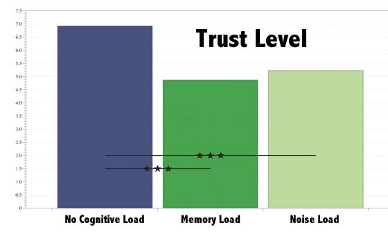
Beyond the obvious, though, there’s cognition research that underscores the need for a smooth, easy experience. Scientists at the University of Warsaw used the trust game as a tool to measure trust under different cognitive load conditions. They used different methods to increase cognitive load of the subjects, and got the same result in each case: subjects experiencing a higher cognitive load were less trusting.

These load conditions were not related to the game or the other player, so the decrease in trust was a non-conscious effect. The key marketing takeaway here is that a difficult or confusing interface will not only frustrate users and make them wonder about the organization’s competence, it will also make them less trusting. They won’t be aware of this change in trust, but it will show in your conversion metrics.
Make things easy for your customers - higher cognitive loads decrease #trust! Share on XAn “Easy” Trust Hack
What if you are competing from a position of lower initial trust? Perhaps your competitors are better known or have a longer history. One approach that can help you offset that disadvantage is a better user experience.
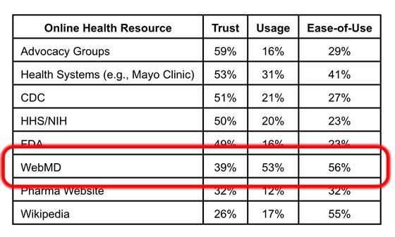
A survey of browsing habits of healthcare information seekers came to a surprising conclusion: consumers would frequent a site if it was easier to use, even if there was a lower trust factor!

Even on a topic where trust is paramount, health information, people gravitated to a site more because of its ease of use than its level of trust. In that study, WebMD was one of the least trusted but most utilized.
Need more traffic and engagement? Study shows ease of use trumps trust. #UX Share on XA Slippery Slide
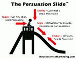
 The element of my Persuasion Slide framework that I consider most important is “friction” – the difficulty in completing the desired action. The reason I find it so important is because increasing results by eliminating friction is usually far less expensive than doing things like driving more traffic, offering discounts, etc.
This data shows that beyond the obvious impediments of friction on a digital property, there’s another effect… the higher the friction, the lower the trust in you and your offerings.
Now’s the time to focus on “easy.” Trust me!
