F-Pattern: A Secret Weapon To Boost Website Conversions

We live in an increasingly digital world and because of that, nearly every business has a comprehensive presence online. These digital domains and social media accounts all serve to promote brand awareness, product loyalty and, ultimately, increase overall revenue.
A recent study from Harvard Business Review (HBR) dug into why consumers choose to purchase from certain online retailers. Ultimately, the researchers discovered that consumers rely on their intuition – not logical thinking – to determine whether or not they will complete a purchase online. Thus, design plays a far larger role in converting users to consumers than one might expect. A beautiful, simple and easy-to-navigate website design will send positive messages of safety and reliance to consumers as opposed to invoking caution.
So, how can you ensure that users feel connected to your particular website?
Well, you’ve got the tried-and-true color psychology, use of high-resolution images and simple calls to action. But there may be another psychology-based design element that you haven’t thought of, yet.
Enter: The F-pattern.
What Is The F-Pattern and Why Is It Effective?
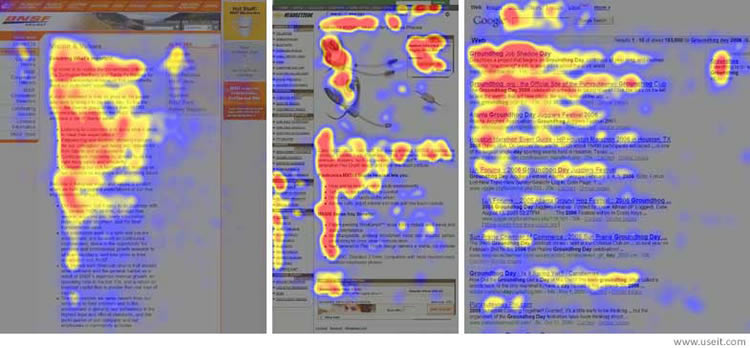
The F-Pattern is a simple layout designed to guide a user’s eye to information that you want them to see based on engrained human behavior. In this case, the F-pattern is rooted in the way we read — left to right.
The idea behind the F-pattern is that website designers can place information in the direct line of viewing. Since English speakers, for example, read left to right, loading the important information in the same structure will prove fruitful, as users will be more likely to consume it.
In addition, people who read left to right naturally spend more time on the left side of a page – it’s where we return every time we want to start a new sentence or search for newer, interesting content. Thus, keeping navigation, additional information, filters or other important elements on that side increases the chance that they will be utilized.
And, when people can see your information, it’s more likely to stick. If it sticks, it’s more likely to convert. It’s quite simple, really!
When the F-Pattern Works Best
According to user experience firm Nielsen Norman Group, there are three specific conditions that lead to viewers scanning your content in an F-pattern:
- A page or a section of a page includes text that has little or no formatting for the web. For example, it has a “wall of text” but no bolding, bullets, or subheadings.
- The user is trying to be most efficient on that page.
- The user is not so committed or interested that he is willing to read every word.
Source: NNGroup.com
How To Implement The F-Pattern In Your Website Design
Here’s where a bit of strategy comes in, because not every website implements the F-pattern. Therefore, if you decide you want to create a webpage (or entire site) based on this layout, remember that you can’t run wild with every design idea that you run across. Sometimes, you’ll have to say no to that certain animation or hold off on the sparkly CTA to keep the integrity of the F-pattern intact.
First, determine the action you want your users to complete on the webpage and the information that is the most important. This will inform the content that you frontload left-to-right.
Don’t fret – it’s not as daunting as it sounds. There’s been a more in-depth research done on the functionality and design of Langara College’s website, and we’ll take it as an example.

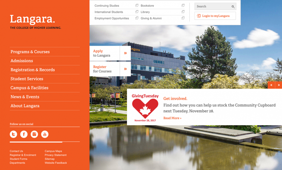
The Vancouver college has a clear F-pattern on their homepage, and the actions they want visitors to complete are evident. Across the top of the page, current students can log into a portal filled with information about their studies. Meanwhile, down the left side and in the second prong of the “F,” potential students can learn about the college and apply for admission. Finally, the third prong – which makes this pattern more of an acceptable, similar E-pattern – you’ll see a slider of recent news.
There are no additional elements or flashy aspects to distract the users from the information on this page, which is particularly important in F-patterns. Instead of being dazzled, visitors can indulge their linguistic instincts.

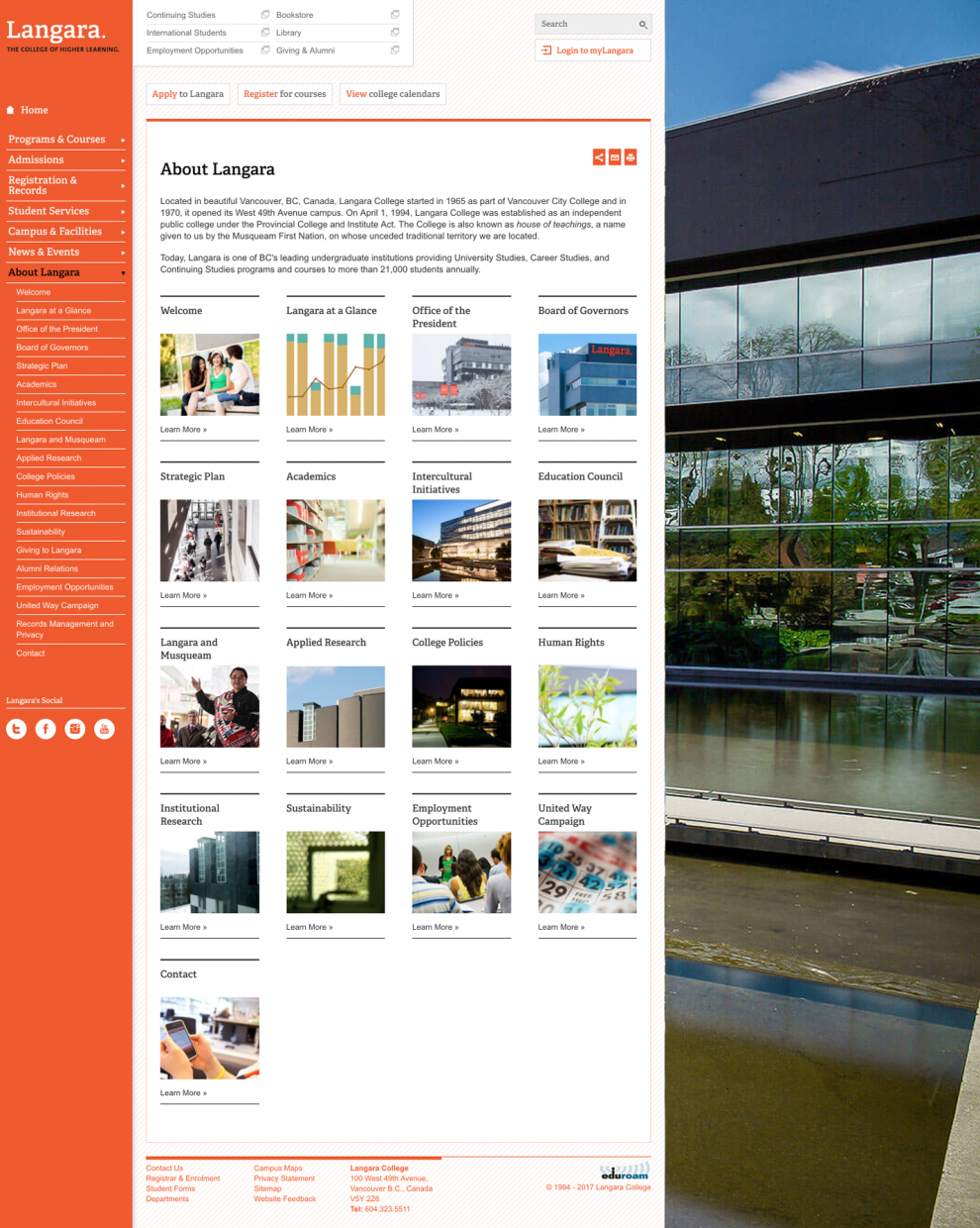
Langara College actually applies the F-pattern throughout their entire website. For example, on their About page, their clean grid is pushed slightly to the left next to the sticky navigation menu we saw earlier, while an image takes up the right side of the page. This slight angling reinforces the intuitive reading pattern.
What’s better? A consistent theme throughout conveys reliability, which reinforces the intuitive decision-making that Harvard Business Review found so prevalent in online conversions.
Conclusion
Overall, the F-pattern is an extremely effective hack to ensure your users are actually consuming the information you present to them. While this layout is fairly simple to understand, there are a few tips that will help you and your website design make the most of it:
- Use short sentences and phrases in the F-pattern – remember, this isn’t a novel!
- While your F-pattern is certainly allowed to transform into more of an E-pattern (particularly in websites with deeper scrolls) frontload your most important information in the first two prongs. They are the most important.
- When in doubt, take a cue from SEO best practices and use things like bullet points and frontloaded keywords to entice readers.
- Don’t forget smartphones! The F-pattern is still effective on mobile, so you’d be wise top optimize your design using this layout.
Will you be trying the F-pattern in your next website design? Tell us why below!
