Fancy Fonts Boost Recall
12
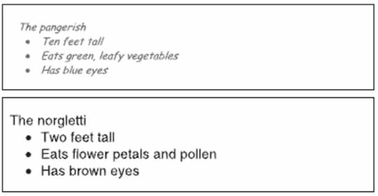
Disfluent and fluent fonts

If you want someone to remember your information, should you use a simple, easy to read font or one that is more complicated and difficult to read? Most people would guess that simplicity is best; after all, we know that simple fonts convince better. Surprisingly, though, those who opted for simplicity would be wrong.

A Princeton study compared student retention of course material presented in both a simple font and more complex fonts, and found that retention was significantly better for the complex font.

Why is this? It appears that the additional effort required to read the complex fonts (also called “disfluent” fonts) leads to deeper processing, and ultimately better recall. The simple font tested was Arial; the complicated ones were Comic Sans Italic, Monotype Corsiva, and Haettenschweiler.

This study was conducted with the idea of enhancing recall in education environments, but the same concept might have some marketing applications. If you want a reader to remember something – a phone number, for example, or the key advantage of your product vs. its competition – making her brain work a little harder to read it might well produce a more persistent memory.

I don’t think I’d start setting long paragraphs of ad copy in Monotype Corsiva just yet, though. We know that people associate much greater effort with disfluent fonts, and seeing a dense block of text in a hard to read font might dissuade the viewer from even attempting to read it. Or, the reader might start the text but give up sooner than if it had been in a simpler font.

Used sparingly, though, a difficult font might be one way to boost recall of important marketing information.

The paper Fortune favors the Bold (and the Italicized): Effects of disfluency on educational outcomes, by Connor Diemand-Yauman, Daniel M. Oppenheimer, and Erikka B. Vaughan, appeared in Cognition.

12 Comments
  1. Brad Einarsen says

    Roger, interesting study.

    This article makes me think that branded Captchas could be used a lot more effectively.

    Also, heatmaps of web pages have shown similar results where smaller fonts which take more effort to read gathered more attention, and more dwell time. The heatmap test didn’t discuss retention, but it makes sense that it would be higher.

    1. Roger Dooley says

      That’s interesting, Brad – your heatmap studies seem to support the research I described. The danger of using a small font, though, is that some people might bypass the content entirely. If you can get people to read it, though, it might be more effective.

      Roger

  2. Linda Secretan says

    Interesting, Brad!

    One might consider including a memorable signature for starters.
    It’s a good challenge: how to draw a reader in with a fluent font, decide what your take away is and reinforce it with a disfluent font.

    Will we be seeing evidence of this in your posts?

  3. Ken Montville says

    I’m glad you suggested using disfluent fonts sparingly. Hard(er) to read text doesn’t stand a chance in a world where the reader’s attention span is short.

    However, this post is a nice teaser for other questions such as:

    – how long should the text be in a disfluent font before the reader bails?
    – how does it work on the Web vs prnt
    – does breaking the text up into other visually interesting styles (such as your “bolding” of certain phrases in this blog post) help with retention?
    – do disfluent fonts become annoying and, thus, counterproductive when overused such as in someone’s default e-mail font?

    Interesting stuff.

  4. Gabriele Maidecchi says

    Surprising finding indeed, even though if you think about it, it kinda makes sense.
    It eventually comes down to finding the right balance, like in all things.

  5. Tony says

    This study was conducted on students who are required to read and digest course material, this is not the case for the casual reader. Does that mean the results would not translate to the real world?

    Perhaps Ken is right though, used sparingly it may work, but any more than a few disfuent words and I think the casual reader, who is not required to make the effort, will move on.

  6. Brendon B Clark says

    Thanks – some thoughtful comments. I’m also interested in the translation to print, and whether the type of reader makes a difference. Do people who scan and skim want simpler fonts, could I use this to reinforce key marketing messages or summary points in educational material, is there an age factor where this becomes useful (how young does it work?) and are there stylistic guidelines for this too? Which difficult fonts are better than others etc.

    Good post – thanks.

  7. Kevin says

    Its interesting to read this post, however i assume that simple readable fonts are being used most by famous or popular website, and people like to follow styles of those web sites..

    I have seen changing trend of using bigger font sizes in recent web designs

  8. Jacob Varghese says

    That is interesting. As mentioned, knowing when and where to use this finding would be crucial. Using a few disfluent fonts to highlight certain parts of the copy could be effective.

  9. Spencer Lambert says

    A fascinating post, and at first glance contradictory to the received wisdom in my field of presentation graphics which is: For your slides to be effective they have to flow with minimal effort into the viewers brain in as short a time as possible, allowing the viewer to concentrate on what the presenter is saying.
    My take on it is that my job is still to make the information easy to find on the slide, but then make it harder to digest! Perhaps it’s not just font style that could be used here, bit maybe a combination of style / size / shade / colour / contrast etc.. I’ll have some fun playing around with this concept.

  10. Dani Bartov says

    Interesting findings, thanks!

    It does raise the question, though: what is more important for marketing material – convincing the reader or being memorable? I would argue for the former, but it’s an interesting thing to think about, regardless.

  11. David Hoo says

    Sorry Roger, but YOU would actually be WRONG.

    The flaw in your thinking is to make the assumption that ad readers are the same as students. Ad readers do not behave at all like students, especially ones at Princeton. We have studied over 5,000 commercials, and whenever you make ad viewers work harder, like with headline with reversed-out type, you loose them. They stop reading or tune out so there would be little retention.

    The difference is that ad viewers are not at all looking to read or view ads; they are primarily there to read editorial or view shows. The exposure to ads is merely an incidental/accidental intrusion, often unwanted. In contrast, students are reading to learn and understand, will be held accountable by testing or grades and pay thousands of dollars in tuition. Of course we know not every student is does this 100%, but students are qualitatively motivated entirely differently than ad viewers. Thus, it is erroneous to simply apply a research finding among one population without first asking, is the other population the same or fundamentally different.

    Our extensive research indicates doing as you advise would be ill advised to their clients, causing diminished advertising results rather enhanced results. Ads must grab and hold attention – necessary but not sufficient conditions, if there is any hope of recall and motivation/persuasion to command a future action, like purchasing a product.

Leave A Reply

Your email address will not be published.