It’s Time to Forget the Fold
If you work with digital ads, you are no doubt familiar with the “fold” – the place where the user’s screen cuts off the content, and scrolling is required to view more. (It’s an anachronistic term from the newspaper days, when stories above the fold in the middle of the page were more prominent than those below.) Many advertising contracts specify “above the fold” placement on web pages, although exactly where that fold occurs depends on a variety of factors like screen resolution, browser window dimensions, etc.
It’s understandable why advertisers demand placement near the top of the page. In 2010, user experience expert Jakob Nielsen published data showing that 80% of user time on a page was spent above the fold. In other words, the top of the page got all the attention, and ads initially out of view would get little or no attention. Here is the eye-tracking backup for that assertion:
Now, however, it seems that user behavior is changing. Or, we have better ways to measure it. In a recent TIME article, What You Think You Know About the Web Is Wrong, Chartbeat CEO Tony Haile (@arctictony) upends the “above the fold” gospel by noting,
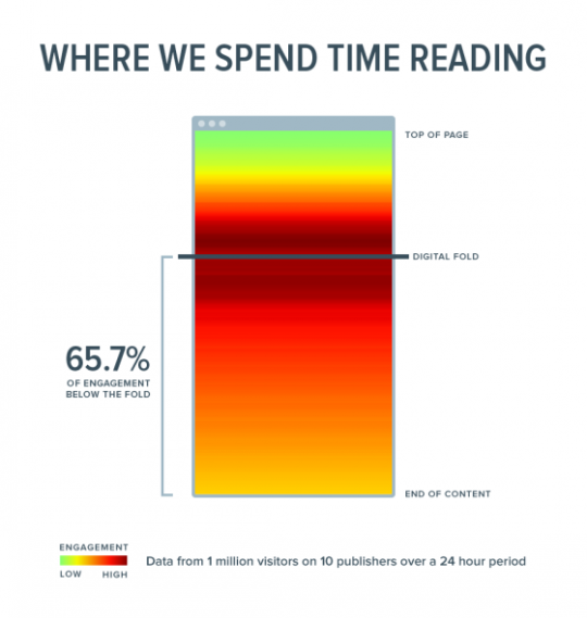
66% of attention on a normal media page is spent below the fold. That leaderboard at the top of the page? People scroll right past that and spend their time where the content not the cruft is.
And that’s not all… Haile writes about a growing shift to the “Attention Web,” in which traditional metrics like impressions, clicks, and pageviews are far less important than the degree to which the visitor engages with the content. In a new article at Digiday, Debunking the myths of the attention Web, he offers evidence of this phenomenon from Yahoo testing:
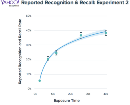
Haile points out that one can use this data to fuel different strategies. One long ad exposure is good, but switching the ad partway through would have even better recall. He acknowledges the reality of banner blindness, but says that great creative will still attract visitor attention.
The conclusion one can draw is that the coveted top-of-page leaderboard isn’t so desirable after all. First, users may tune it out due to experience-based banner blindness. They have learned that the long rectangle at the top of the page is usually irrelevant to what they visited the page for.
Second, the top placement will get exposed to everyone who visits the page, but those impressions will include plenty of disengaged visitors who are about to hit the back button, click away, or close the window. Even those visitors who will ultimately engage with the content may not be “hooked” yet.
Blogger Lessons
Ask experienced bloggers who have optimized their list-building efforts what the best-converting location for a “subscribe” box is and they’ll never answer “a top banner ad.” The most common answer I’ve received is “at the end of the post, when the visitor knows you are offering good content.”
Subscriptions are a special case, of course, but the success of this spot reflects the high level of attention from an interested reader.
In short, it’s time to start thinking “below the fold” to maximize ad impact. As a bonus, some publishers sell these previously undesirable spots at big discounts – that will increase the ROI of these placements even more.
What has your experience been with ad placements? Do you still focus on above-the-fold, or have you achieved better results with less traditional locations?
The most important thing is how nicely one presents.If content is interesting, ads below fold will also work. If content is not appealing, top fold will prove better option for ads. You are correct to say its high time to pay attention on below fold which is less expensive( to ad} too, but one should ensure that the content is good so that visitors spend more time on it.
It’s a shame they didn’t measure focus along the X-axis. While people might be focusing more just below the fold, it would be good to know whether that focus is distributed to the right side of the screen at all (where adverts and subscribe boxes are typically located).
Good point, Kash. Eye-tracking studies would show the merits of different horizontal placements. Presumably, the left side would be better for cultures that read left-to-right. Of course, the same issues would kick in: visitors might glance past an obvious ad to get to the content they want.
Every study I’ve seen indicated the upper right is the first place the eye travels on a website… but maybe that has changed too. That’s the beauty of the Internet, it’s in a perpetual state of evolution.
It is good to read about the real world. Here in Poland is dominated by advertising in newspapers. For digital ads need to pay a lot. They are very popular technology. In recent weeks, is introduced in large cities (among others. Krakow, Warsaw) LED advertising. There are also a few months offer expensive advertising on the internet. For us – Poles – a very popular technology. Dominate the leaflets thrown into letterboxes, or advertising in the press. I feel we are in Poland quite outdated, when I read about what abroad to the west …
Very interesting article, Roger.
Based on my experience, Leaderboard ads is one of the worst performing ads. And my conversion rate increased after i put my subscription box below content.
On one site, Ari, I found a 300×250 ad placed centrally significantly outperformed a leaderboard and an above-the-fold sidebar tower ad.
The heat diagram by Time refers to 10 publishers, where visitors are going there to read content, not shop. The Yahoo research is measured by recall, not dollars. What about orders and sales? My bet is that Jakob’s data is still relevant to ecommerce sites. Shoppers do not necessarily need a lot of copy to make a buying decision. And frequent buyers prefer their clicks to be one and done. Else Amazon Prime would not be so popular.
All good points, Chari. To borrow my friend Chris Goward’s great book title, “You should test that.” Just because something worked in one place doesn’t mean it will work someplace else. At best, it provides a hypothesis to test. Thanks for your well-informed comment!
Roger, I’ll take a stab at one reason perhaps why the fold is less important. Historically our website experience was one of ‘pages’. And if there was content further down a page, we perceived it at simply further expansion of the content above the fold. So, if I ‘got it’ in terms of the message, above the fold, there was less reason to scroll further down. However, with today’s websites, it’s one long, long scroll and I’m picking up entirely new themes and concepts as I scroll down. (And with many websites for software just being almost one page for the entire site.) So, there’s ‘discovery’ that I might be missing if I stop short. In other words, we’re being trained that there’s important content below the fold by this shift in website page structure, hence we are ‘obeying’ and scrolling in response.
Great points, Larry. I think many websites (and apps) are training users to keep scrolling – sites like Google Image Search, Instagram, and many others don’t put the most important stuff above the fold – the stuff you scroll down to is of the same importance as what’s at the top.
I agree about the scrolling websites and I’ll throw out another major player in scrolling psychology: Facebook. It seems to me that the Facebook Feed has helped teach people to think, “Hey, maybe something even better is below the fold.”
It would have been nice to see the list of publishers – and the specific pages they measured.
If they are like most newspaper front pages today they’re built to make people scroll.
It’s a natural thing to “go deep” as a lot of newspaper readers don’t use categories or navigation, but get their entire news experience by scrolling down the front page.
As mentioned above the experience can be a lot different on other types of sites