Free Web Page Heat Maps?

The common belief is that neuromarketing is trying to find the mythical “buy button” in the brain. If you are an ecommerce web designer, though, the “buy button” is one thing you want to be sure your visitors can find very easily! One of the more reliable techniques for web designers has been using eye-tracking to generate visual attention “heat maps” like those created by my fellow Pubcon speaker Gordon Hotchkiss at Enquiro Research. The only problem with eye-tracking is that it takes specialized equipment and expertise, and hence may not be affordable for many websites. Wouldn’t it be great if the process could be automated, and performed for free on any web page? It sounds outlandish, but there’s a website that makes this claim.
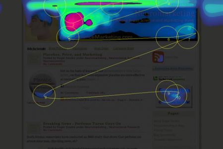
Feng-GUI has a simple interface that lets you plug in a web address and see an immediate “heat map” of the page. The illustration above is a heat map for the Neuromarketing home page. It shows hot spots around the header graphics and other images, with the viewer scanning left to right, and then restarting with another left to right scan. This seems somewhat plausible for a first time visitor, though I’d expect a regular reader to be less distracted by header graphics and other repeating images. (On the Feng-GUI site itself, there’s a transparency slider control that lets you more readily see which page elements are hotter or cooler.)
Feng GUI says that their automated algorithm is based on real eye-tracking studies and other data:
The Feng-GUI heatmap is based upon neuro-science studies of feature integration theory, salience, visual attention, eye-tracking sessions, perception and cognition of humans.
Or in English: “What people are looking at?” It captures a snapshot image of the requested website or the uploaded photo and generates a visual attention heatmap.
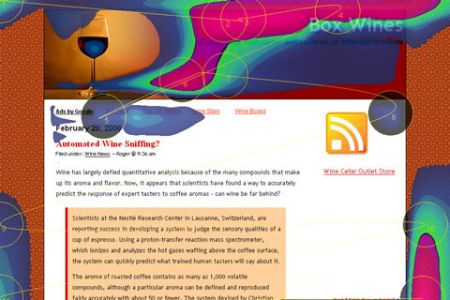
Based on the marginally believable map of this site’s home page, I plugged in another blog page, this one about wines, and generated this map:

Here, we again see a focus on header images, but also a prediction that viewers will find the repeating background pattern unusually interesting. This is completely implausible, even for a first-time visitor. Here’s a version that shows the hot spots against the actual page:

What’s my take on this tool? First, it’s no substitute for real eye-tracking if you have the budget for that kind of service. The Feng-GUI algorithm isn’t sophisticated enough at this point to analyze individual images. For example, we analyzed our post about how humans are programmed to react to baby faces, and the face of the baby got barely a glance from Feng GUI. I’m sure a real eye-tracking study would have had a significant hot spot there.
Second, despite its limitations, Feng GUI may be a fun tool for designers who are trying to optimize page elements. I say that not because the Feng GUI’s heat map will be accurate, but because it will force designers to think about what the important elements on the page really are (like the buy button!) and perhaps cause positive changes. Did you ever try to explain a problem to someone who didn’t understand the issue, who asked uninformed questions, and offered dumb advice? Sometimes, in the course of that kind of seemingly unproductive exchange, you arrive at a good solution yourself. Start playing around with Feng-GUI, try some different concepts, and who knows what you might come up with?
Thanks to Le Blog du CR, which was (if my college French is accurate) was redesigned based on Feng GUI’s findings.
