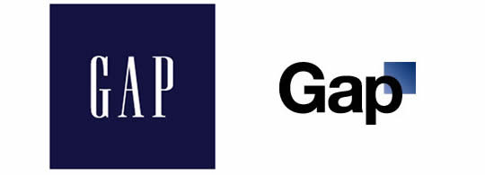
New Gap Logo a Neuro Failure

Just about everyone has an opinion on the new Gap logo (now hastily withdrawn by the firm), and NeuroFocus has jumped on the bandwagon by conducting EEG and eye-tracking studies of consumer response to the design. Overall, they found the revamped design didn’t light up their subjects’ brains the way an exciting new logo should. The new design failed to register on what NeuroFocus calls the “stylish” attribute, while the original logo tested as “exceptional.” In addition, the new logo failed to improve on their “Novelty” metric measurements.
Dr. A.K. Pradeep, NeuroFocus CEO and author of The Buying Brain, identified six ways the new Gap logo violated what the neuromarketing firm considers to be best practices based on their research:
Overlays Equal Overlooked: Neuroscience research reveals that when words overlay images, the brain tends to ignore or overlook the word in favor of focusing on the image. “In the new logo, the ‘p’ superimposed over the blue square is essentially bypassed by the brain; the brain tends to ignore the word in favor of the image. Not a good thing when that’s your brand name.”
Sharp Edges Unsettle the Subconscious: “Forcing the brain to view a sharply-angled box behind the letter ‘p’ provokes what neuroscience calls an ‘avoidance response’. The hard line cuts into the rounded shape of the letter. We are hard-wired to avoid sharp edges — in nature, they can present a threat. Our so-called modern brains are actually 100,000 years old, and they retain this primordial reaction.”
Interesting Fonts Work: Neuroscience research has shown that the subconscious prefers fonts that are a little unusual. The Gap’s original typeface was just different enough that it tended to stand out to the brain amidst the clutter of other corporate IDs. “Being a little bit ‘funky’ appeals to the brain, and the Gap’s original design accomplished that by employing an interesting font. Our study confirms that, and shows why ‘boring’ is bad for business when it comes to type.”
High/Low Contrast: “The original logo presented the brand name in sharp, strong contrast — white letters ‘pop’ against the blue background, and the brain loves pop-outs. Conversely, the new logo has the ‘p’ losing that contrast against the blue box. Again, the brain simply tends not to register the letter well as a result.”
Stronger Semantic Content: “In the new version, the capitalized ‘G’ followed by the lower case ‘a’ and ‘p’ cause the brain to read the three letters as part of a word, and therefore seek semantic content. In the original execution, all three letters are capitalized, making them more logo-like than word-like, which is what you want for a logo.”
Lost Legacy: “The Gap sells a lot more than just blue jeans today, but relegating the blue of the original logo to minor ‘legacy’ status in the new version loses that essential connection in the consumer’s subconscious to the brand’s core origins. We always emphasize to companies: depict your source. When it comes to products, the brain seeks to know from whence you came. Instead of honoring their past, unfortunately the Gap relegated that past to lower relevance.” [Entire news release: Brain Gap: NeuroFocus Study Reveals What Went Wrong With the Gap’s New Brand Logo.]
Whether you buy the neuro-explanation or not, the new logo was reviled by just about all viewers. The IPelton blog called it the worst branding failure since New Coke. BeBranded suggests that perhaps management was just bored.
To me, it looked like the generic work of a $199 logo mill, with its boring font and little gradient square. The new logo was so bad, a cynic might think that the whole episode was a sneaky way to get lots of coverage in the press and social media. I’m not the only one thinking that way, apparently – Emily Knapp of WallStCheatSheet suggests the same.
For now, at least, the classic logo (with its superior brain activation ability) is back.
