Need More Sales and Leads? Google Wants to Help!

For most attendees of Pubcon Las Vegas, the best part of Matt Cutts‘s keynote was his measured and nearly genial response to the previous day’s attack on both him and Google by Internet entrepreneur Jason Calacanis. Cutts heads up Google’s Web spam team, and Calcanis blames Google for destroying his Mahalo.com business when they launched their Panda update. The update targeted content farms, sites that generated large quantities of low quality content optimized for search.
This was a signature exchange – when was the last time when you went to a conference and one keynote speaker called another keynoter a “liar” and his company “evil,” not to mention a “bad partner?” Calacanis launched his attack with emotion, and Cutts responded with a calm recitation of the facts that led to the Panda rollout. (See my Forbes post for more: Is Google Really Evil? Or Just Smart?)
WD-40 for Your Website
While the verbal sparring between the two keynoters was fascinating, my high point of the sessions was when Cutts dropped a phrase into his PubCon Las Vegas keynote that Neuromarketing readers can identify with: he talked about a new autocomplete feature in Chrome that would “reduce friction” when site visitors have to complete forms. Websites will be able to add a “request autocomplete” tag that will result in visitors being prompted to have Google fill in the form from their stored data.
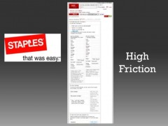
The reason this tidbit resonated with me, at least, was that it directly recalled my “high friction” slides from my PubCon Masters Group keynote two days earlier. Cutts wasn’t there, so I have to assume came up with the metaphor himself. (Or, to put a more evil spin on it, Googlers might have surreptitiously streamed my speech from they eyewear of one of the several people in the room sporting Google Glass. Just kidding. I think.)
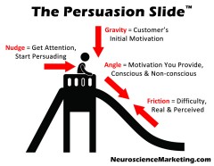
 In my Persuasion Slide model, friction represents difficulty in a conversion process – either real difficulty, like a complicated form, or the appearance of difficulty, like disfluent fonts that make your brain work harder.
Forms are one of the most common friction points that reduce conversion. People don’t like to fill them in. Longer forms are worse – every additional field will reduce the conversion rate.
I found the form shown in the illustration when I clicked an email link for a “free article” – the topic looked interesting, but when I arrived at the page I didn’t see the expected content.
Instead of the article, I was confronted with a 13-field form. Not only were there lots of fields, but some of the questions were perplexing. One asked if I currently had a “solution.” The next field asked when I’d invest in one. Solution for what? I just wanted to read the article!
I’m sure the sales department loves the detailed leads they get from this form – incoming leads can be prioritized and assigned to the best person, and low-probability leads relegated to email followup. But how many leads are never created because visitors take one look at the form and hit the back button?
Got Forms?
 If you have a form on landing pages, order forms, contact pages, etc. they are friction points. Want friction? Use an order form like Staples that runs multiple screens in length, has lots of fields, often accompanied by lengthy text instructions.
The first thing you should to is simplify your forms as much as possible. (Do you really need their fax number?) Once you have eliminated all but the most essential fields along with any unnecessary text, add the requestAutocomplete tags. If a visitor can complete the form with one-click, you’ll maximize the conversion rate. (More info for techies: Using requestAutocomplete().)
This simple step will cost nothing and, when fully implemented in Chrome, will boost your results among a large segment of visitors without having to buy more traffic.
 Cynics might suggest that this is yet another ploy by Google to get still more information about you. Once it knows enough to fill in most forms for you automatically, Google will know as much about you as the companies you are dealing with. (Then again, they probably know that stuff already.) For ecommerce and lead-generation websites, though, implementing these tags is a no-lose proposition.
Ultimately, perhaps, we’ll have such good standardization of forms and data that a form with a dozen fields won’t be off-putting because a single click will complete them all. Until then, maximize your results by minimizing the number of fields!
Here’s more thorough coverage of Matt’s speech from SearchEngineLand: Matt Cutts At Pubcon 2013: Moonshots, Machine Learning & The Future Of Google Search.
