Got Branding?
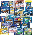
The last time I wrote about Nabisco’s Oreo brand, it was in Mega-Branding: The Purple Oreo Problem. In that post I was critical of the seemingly crazy proliferation of Oreo variations – 46 offerings, including “Purple.” My criticism was based on research showing that offering consumers too many choices can reduce sales.
Well, there are still lots and lots of Oreo varieties, but Nabisco is redeeming themselves in part by sending a strong brand message. The ad shown above has scored exceptionally well in viewer engagement according to Sands Research, a neuromarketing service provider:
The most noticeable aspect of this ad is the tightly coupled brain responses with the events of the advertisement. This ad was the highest recalled spot in the study and a high degree of attention was paid to the events of the subsequent appearance of the logo and product. The brand name ‘Oreo Cookie’ was the dominant response during the recall.
You can read more analysis from Sands and also see simultaneous brain activity recorded while viewing the commercial here.
What I like about this ad is not just that it grabs the viewer’s interest and sets them up for the Oreo punchline, but that it sends a message that is equally applicable to the dozens of Oreo variants. This really is magnetic branding.
I especially love the way the orientation of the cow combined with the simplicity of the landscape grabs your attention from the first second.
I agree, this is a hard ad to look away from! If you caught the first second or two of this ad while fast-forwarding past commercials on a DVR, I think you’d stick around to watch.
Roger
The sound. The moving udders. The landscape and the orientation of the cow. This is an ad that definitely surprises Broca’s area of the brain, but also brings it all together with a relevant message: Milk is the perfect companion to an Oreo cookie.
Well done.
This spot really grabbed my attention from the start, but what I really enjoy is the historical relationship Oreo’s have with milk. Finding a new compelling way to showcase this relationship that consumers have with their product is what makes this spot a success in my mind.
FTW
This ad is perfectly viral. I already forwarded to my wife who will certainly post it on Facebook!
Roger, you took the words right out of my mind. I was thinking that if I was running through ads that I would stop just to see what this one was about.
Could that have been intentional?
Intentional? That I took the words out of your mind (not too likely, but possible), or that the ad was designed to stop ad-skippers? I think many advertisers these days try to include images that, at least the first time, might cause a fast-forwarding viewer to pause. Some include branding images that are visible for long enough to register an impression even during fast forwarding.
The “skip” button is tougher to deal with, but chances are if the user is moving forward in 30-second leaps he will see a second or two of the ad.
Roger
I doubt this ad touches the audience who demand healthier life style for their children.
Notice the kid in the ad, would you agree he doesn’t depict healthy living. is this the message Ore is sending to their audience…
cute that’s it? in the new paradigm it the brand doesn’t not fit into the consumer’s value system it won’t cut