The Neuroscience of Conversion Optimization
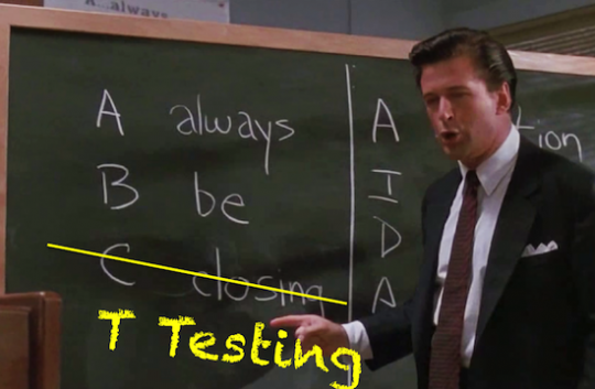
[Guest post by Nick Kolenda] If you’re a digital marketer, then you know the feeling. You poured your heart and soul into a recent campaign, and you can’t wait to see the results. A few days later, you check the data and what do you see…an embarrassingly low conversion rate.  We’ve all been there. It hurts. But fear not, fellow digital marketers. Before you throw in the towel, you could try to boost those painful results. This post will explain three principles from neuroscience that can increase your conversion rates. I’ll first describe the academic research behind the principle (so that you know why it’s effective). Then I’ll give you some actionable ideas to incorporate those principles. Take heed, though. Sometimes principles—no matter how much they’re backed by credible scientific research—will produce odd results. It’s a matter of life. When you read these principles, you should follow the advice of conversion expert, Chris Goward, and, “You Should Test That!”
Processing Fluency
Processing fluency is fascinating. But I’m also a psychology nerd—so I might be biased. Here’s the gist:
Processing Fluency – The ease and speed with which we process information (and how it influences our opinion of that information)
Generally, the faster and more easily we’re able to process information, the more positively we evaluate that information. Example: Want to invest in the stock market? You should consider investing in a company with an easy-to-pronounce stock symbol (e.g., KAR), rather than a difficult-to-pronounce stock symbol (e.g., RDO). Researchers found that easy-to-pronounce stocks outperform difficult-to-pronounce stocks in certain situations (Alter & Oppenheimer, 2006). You can thank processing fluency for that.
Why Does It Work?
So, why does processing fluency cause people to perceive KAR stock to be more favorable than RDO stock? Good question. The answer lies in misattribution. When people can process a stimulus quickly and easily, they experience a positive emotion (Reber, Schwarz, & Winkielman, 2004). When they experience that positive emotion, they mistakenly attribute those positive feelings with their opinion of the stimulus. When people experience a positive feeling through easily processing a stock symbol, they misattribute those feelings to a positive evaluation of the company. Then, once they get that “good vibe,” they fall prey to confirmation bias. They seek out information to support that positive first impression, rather than evaluate the company’s financials from an unbiased standpoint. Pretty cool. 
How to Apply It
How can you use processing fluency to lift your conversion rate? Sure, you could design a simple website layout and write clear copy. But you should already be doing those things. Instead, the suggestions in this section will focus on one strategy: get your visitors to process your call-to-action as quickly and easily as possible. The more easily they process and digest your CTA, the more likely they will be to misattribute those positive feelings to a desire to perform your CTA. Here are a few ideas to get you started…
a. Emphasize Your CTA Button
Make your CTA button—or the area where you want visitors to click—stand out as much as possible (while still making it look like a button). 
Use Visual Contrast
Place Directional Arrows
Position Social Cues
Image Sources: Unbounce, MembersFirst, Tobii
b. Repeat Your CTA
You may have heard of the mere exposure effect: the more often we’re exposed to a stimulus, the more appealing we find it (Zajonc, 1968). A repeated stimulus becomes more appealing because of processing fluency. When we’re repeatedly exposed to a stimulus, we’re able to process it more easily the next time we encounter it (and we misattribute that ease of processing to our fondness for that stimulus). As long as you don’t confuse your visitors, repeating a CTA can increase your conversion rate. Those repetitions will help visitors process your CTA more easily (and the more easily your CTA pops into their head, the more likely they will be to convert).
Congruent Attitudes
In my book, Methods of Persuasion, I coined the term “congruent attitude” to help explain a powerful psychological tendency.
Congruent Attitude – An attitude that you develop after performing actions consistent with that attitude
When you perform an action (e.g., you read an article on neuroscience), you tend to develop an attitude that is congruent with that action (e.g., “I am interested in neuroscience.”). Even if you didn’t hold that attitude initially, your action—by itself—can cause you to develop the attitude. More importantly, once that attitude is formed, you become increasingly more likely to behavior in a way that is consistent with that attitude (e.g., purchase a book on neuroscience). Example: Popularized by Robert Cialdini (2001), the foot-in-the-door technique is a deviously powerful persuasion strategy. Research shows that you’re more likely to gain compliance with a large request if you first ask people to perform a smaller request. When people perform that smaller request, they form an attitude that they are the type of person who would help you. Not complying with a subsequent larger request would contradict that attitude. Whenever our behavior contradicts our attitude, we feel a state of discomfort known as cognitive dissonance (Festinger & Carlsmith, 1959), which activates the dorsal anterior cingulate cortex and anterior insula (Veen Krug, Schooler, & Carter, 2009). Once we feel that discomfort, we try to fix it. How? We resolve the inconsistency between our attitude and behavior by adopting a new attitude—an attitude that is consistent with our behavior. Once we regain consistency, the discomfort in our brain fades away, and everything returns to normal. Problem solved.
How to Apply It
There are two strategies that can help you use congruent attitudes to boost conversion rates. You can either (a) convince your visitors that they hold a certain attitude or (b) use more micro-conversions.
a. Suggest an Attitude
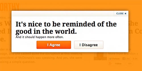
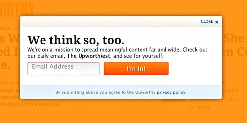
First, you can try to convince your visitors that they hold a certain attitude. Then, they’ll be more likely to behave in line with that attitude. Upworthy is a great example. In their email opt-in, Upworthy asks visitors whether or not they agree with this statement: “It’s nice to be reminded of the good in the world.”  Only a cold-hearted soul would disagree with that statement. But here’s where it gets interesting. After you click “I agree,” Upworthy then hits you with this bombshell:
  Uh oh. You just said that you enjoy being reminded of the good in the world. Choosing not to be reminded of the good in the world would be inconsistent with your attitude (thus creating cognitive dissonance). Due to the psychology of congruent attitudes, you’re more likely to avoid that discomfort by signing up.
b. Use More Micro-Conversions
There’s another way to use congruent attitudes. You can reinforce an attitude by getting your visitors to perform smaller actions on your website. What kind of smaller actions? If you’re a charity or nonprofit, you could ask people to sign a petition, rather than donate. People who were visiting a charity’s website were more likely to donate if they were first asked to sign an online petition (Guéguen & Jacob, 2001). That small action reinforced a congruent attitude that they cared about the charity—thus they were more likely to donate to remain consistent with that attitude.
Social Similarities
We all know that social pressure is powerful. But that pressure becomes even more powerful when you combine it with another psychological principle: similarities.
Social Similarity – A similarity that you share with a group of people
Extensive research shows that we’re influenced by people who we view as similar (Burger, Messian, Patel, del Prado & Anderson, 2004). Research also shows that we’re influenced by social pressure—we’re more likely to perform an action if we believe that many people are doing it (Asch, 1951). Given those two powerful tendencies, you can extract more conversions when you show that a large group of people are performing your call-to-action and that those people are similar to your prospect. Example: Goldstein, Cialdini, and Griskevicius (2008) examined which type of message would influence more hotel guests to reuse their towels to help conserve the environment. Here’s a condensed overview of each message:
Regular Pressure. HELP SAVE THE ENVIRONMENT. The environment deserves our respect, so reuse your towels during your stay. –37 percent compliance Social Pressure. JOIN YOUR FELLOW GUESTS IN SAVING THE ENVIRONMENT. In a study conducted in Fall 2003, 75% of guests reused their towels. –44 percent compliance Social Similarity. JOIN YOUR FELLOW GUESTS IN SAVING THE ENVIRONMENT. In a study conducted in Fall 2003, 75% of guests who stayed in this room reused their towels. –49 percent compliance
The researchers found that the least effective message was the standard appeal (i.e., the environment deserves our respect). They were able to extract more compliance when they used social pressure (i.e., most hotel guests reused their towel). What’s interesting, though, is that they were able to extract even more compliance when they showed a similarity with that group (i.e., most hotel guests who stayed in this room reused their towel). Despite a similarity that was based on circumstance alone, that similarity extracted significantly more compliance.
Why Does It Work?
Ever since Solomon Asch’s conformity experiment in the 1950’s (Asch, 1951), social pressure has been a powerful persuasion strategy. But why is it so powerful? The answer lies in our brain’s neural circuitry. Emerging research shows that social rejection and physical pain share the same neural system (Eisenberger & Lieberman, 2004). Back in our ancestral days, we needed that overlap. That painful feeling of social rejection prevented us from becoming separated from our caregiver. Fast forward millions of years and that evolutionary trait still exists today. Whenever we see a large group of people performing some action that we’re not doing, our brain’s wiring causes us to experience discomfort. That’s why social pressure can be so powerful. But what about similarities? Just like social pressure, similarities are also evolutionary. Our ancestors gravitated toward similarities because they posed less of a threat. Besides evolution, though, implicit egotism is another reason why they work. Researchers have found that we all possess a certain degree of self-centeredness, giving us a nonconscious urge to gravitate toward things that we perceive to be similar (Pelham, Carvallo, & Jones, 2005).
How to Apply It
a. Emphasize a Similar Social Group
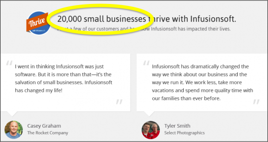
Not only should you use social pressure to persuade prospects, but you should also try to make that social group seem similar to your prospects. When businesses list their testimonials, they often say something like, “See what our customers are saying.” Though there’s nothing technically wrong with that statement, the wording can improve. Your prospects aren’t customers yet, so that social group is dissimilar. Instead, your testimonials would be more effective if you replace “customers” with a group that is more closely aligned with your target prospects. Do you target:
- Small businesses?
- Entrepreneurs?
- Parents?
- Families?
- Students?
- Another group?
Your testimonials will be more effective if you focus on one of those distinct social groups: 
Source: Infusionsoft
You could even emphasize a group in which people merely want to belong. For example, Raven and ConversionXL show that their target prospects are made of “smart birds” and “smart people.”  Who doesn’t want to be considered smart? I sure do. I better sign up for their email lists.
b. Segment Your Prospects
Finally, when you do any form of marketing—either online or offline—don’t simply blast the same message everywhere. Segment your potential customers so that you can tailor your message to them. People will be more likely to click and convert if they believe people from their social group are clicking and converting. Suppose that you’re creating a digital marketing campaign to promote your new eBook on time management—an informational product that would be great for entrepreneurs. Though you could direct your efforts toward websites about entrepreneurship in general, it might be more effective to target websites and blogs that deal with specific entrepreneurial careers, such as:
- Graphic Designers
- Web Developers
- Copy Writers
- Real Estate Brokers
- Entertainers
- Photographers
- And many more…
By creating a specific message tailored toward each of those segments (while showing how people from their respective social group are enjoying the eBook), you’ll be able to convert people more easily than by blasting the same message to all general entrepreneurs.
Summary
When trying to improve your conversion rates online, you can take advantage of processing fluency, congruent attitudes, and social similarities:
- Your call-to-action button should stand out as much as possible (assuming it still looks like a button). Use visual contrast, place directional arrows and social cues toward it, and repeat your CTA. If visitors can process your CTA quickly and easily, they will be more likely to misattribute that ease with a desire to perform your CTA.
- Extract a congruent attitude from your visitors—an attitude that reflects somebody who would convert. Once they form that attitude, they will be motivated to act in a manner consistent with that attitude.
- When you use social pressure, make sure that you’re emphasizing a group that is similar to your visitor. If your visitors can see that a lot of similar people have converted, then they will be more likely to convert.


