Where NOT to Sell to Retail Customers
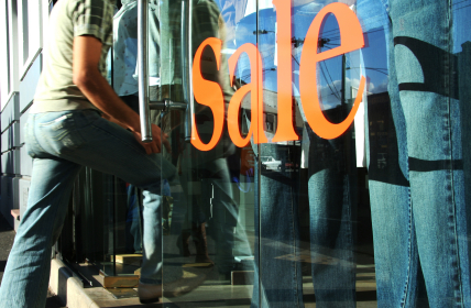
If you want to be sure to make a great impression on your retail store customers and let them know about today’s great bargains, where should you make your pitch? Just as they enter your store would at first glance seem to be the optimal place. After all, you’re guaranteed to catch 100% of the incoming shoppers, and they are no doubt looking for some guidance, right? And, if you were welcoming someone to your house, you’d do it as they crossed the threshold, so why not do the same in a retail store?
Wrong, wrong, wrong, says retail behavior expert Paco Underhill. In an article in the current Business Week, (online version – How to Win Frugal Consumers and Influence Them to Buy), Underhill states that this is the WORST place for signage. Why? Because shoppers use the area just inside the entryway as a decompression zone, and simply don’t notice signs that are placed there. And as for the optimal time to greet a customer, Underhill suggests letting about a minute pass before doing so.
Paco Underhill has some great research. The best strategy for retailers would be to have research done for their store in particular – on their customer’s experience!
I think it’s about time for store to experiment and actually A/B test what’s going to be effective. Underhill might be right about customers treating the entryway as the decompression zone, but if you are visiting 6 stores in a roll, we become oblivious to all signs. Also, the messiness often drives potential consumers away. Just b/c everything is on sale now, doesn’t mean we have to stand there for 30 mins in order to pick out what we like.
It’s an uphill battle for the retailers to get shoppers to buy again!
As a design consultant working with businesses, I agree that the experience that happens for a customer when they first enter a space is critical. Bombarding them with signage does not carry your message well. Everyone coming into a space has unconscious responses that you can influence. Look to create a consistent message that speaks your uniqueness, appeals to your specific client/s, and presents your goods. The entry is like the beginning of a good story.
Don’t you believe that grocery shoppers are looking for what’s on deal and what’s new in store immediately as they enter the store. That is where sale fliers have always been placed. Please let me know your thoughts and if any research has findings on this topic.