Increase Your Visitor Engagement, Increase Your Profit

[Guest post by Marie Dean]
I recently came across a few case studies and had some conversations with other analysts in the field that really made me think long and hard about visitor engagement.
If you think about it, without engagement – there is nothing. Shoppers don’t add items to their carts. They don’t sign up for your newsletter. And they don’t share you on social media.
Those are the obvious calls to action that we want our visitors to take.
But how do we get them there?
With more engagement along the way.
Think about the word engagement for a minute. People get “engaged” when they are committing to a future marriage.
Getting your visitors engaged helps them to commit to a transaction on your website.
Now, I’m not going to focus on copywriting or sales letter pages. Copy deserves an article all of its own.
I’m going to focus on different elements that you may not have thought about before, but which merit closer examination.
I recently spoke with David Rozenblatt, Chief Conversion Officer at Super Fast Funding. Our conversation focused the specific changes he made to the company’s website for better visitor engagement.
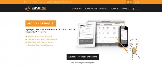
Here’s the original home page….

It’s not very engaging, unless you arrive looking specifically for a free credit evaluation. But even then, a black button wouldn’t be my first choice.
We can’t read the documents that our smiley faced cartoon is pointing at, so they’re of little value.
The page also makes a critical mistake in asking the question “Are you fundable?” in their headline.
Well… the answer to that could be “yes” or “no”. Many visitors, no doubt, are pretty sure no one is going to give them a loan. So why bother asking?
A question like this causes potential dis-engage.
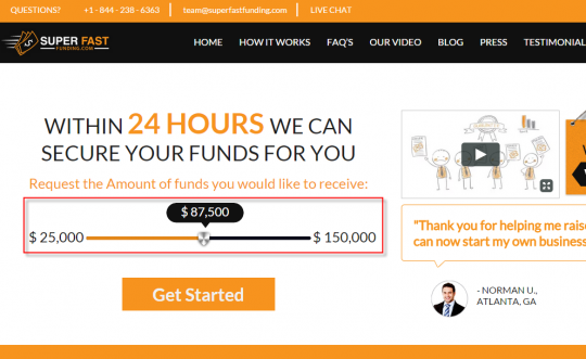
Now take a look at their new home page design, which does a far better job of increasing visitor engagement.
I’ve always liked the idea of adding a little text preceding a phone number to nudge visitors to pick up the phone and call. And they do that by preceding their phone number with the word, “Questions?”
They’ve also added a video directly to the page instead of hoping visitors will find it in the menu bar.
Live chat has been added. A blog has been added. A “Get Started” button has been added.
All of these are good ways to increase visitor engagement.

But what really impressed me about the new design is how they took away the “No” response and, hence, the doubt in the visitors mind. They replaced by giving the visitor power and control in the form of a slider bar.
Think about it. First, they tell you they can secure your funds in 24 hours. Then, they let the visitor choose the amount of funds that they’d like to receive, and they’ve done it in the form of a slider bar.
Unlike a boring form field where you input a dollar amount, a slider bar welcomes engagement and gives a sense of control to the visitor.
Genius.
When your visitor feels in control, their anxieties are reduced.
Looking for more ways to increase engagement with your visitors?
I’ll share an interesting case study showing how LiveLOOK is improving customer service online.
When you’re in a brick and mortar store, there are usually sales clerks to help you with your transaction. While sales clerks can be pesky annoyances if you are merely browsing, sometimes you really need their help.
LiveLOOK is a co-browsing, otherwise referred to as screen sharing, platform where customer service agents can share their shopper’s screens and help them with their transaction.
And it seems to work…
Case Study: Co-Browsing Reduces Visitor Frustration and Reduces Call Handling Times
A leading organization in health insurance implemented LiveLOOK’s into their customer service strategy.
When visitors needed assistance in registering, paying bills online, or finding more information, they could call on agents to help them by sharing their screens with those agents. The agents could then show them where to go and what to do.
The client immediately noticed that call handling times were drastically reduced. Calls that once took up to an hour were now cut down to 7-10 minutes on average.
The 85% reduction in required resources translated to significantly lower costs.
Perhaps even more important was that call center reps reported a big reduction in visitor frustration. A smoother experience increased customer satisfaction and loyalty.
In this case, visitor engagement with the site increased, and the company engaged more directly with those visitors.
It’s also vital to track that engagement.
HotJar is a newer tool that bundles several visitor engagement tools along with tools to track visitor engagement.
Within one solution, they’ve bundled surveys, exit polls, heat mapping, visitor playback sessions, user tester recruitment and form & funnel analysis.
Surveys
When you operate a brick and mortar store, you can always ask your shoppers questions to help create a better shopping experience.
You should be doing the same with your online store.
Why? Because without them you might have no other way to find out what’s going on in your visitor’s heads.
Surveys can reveal some pretty interesting stuff.
For example, a survey conducted by Wakefield Research which surveyed 1,000 American adults found that 51% thought that stormy weather affects Cloud Computing.
So it can be really important to find out what your visitors are thinking.
When creating a survey, try to ask open ended questions that solicit more than a “yes” or “no” response. This will enable you to obtain more meaningful feedback.
It’s also a good idea to offer an incentive to get more people to fill out your survey.
Exit Polls
Exit polls are pop up boxes that allow you to ask your visitors a question as they are leaving your site.
Typically the questions are in the vein of “What kept you from purchasing our product/service today?”
They’re generally used to find out visitor objections. If responses cluster around specific problems, those should be addressed quickly. For every visitor that takes the time to describe a negative aspect of their experience, you can be certain many more didn’t bother.
Heat Mapping
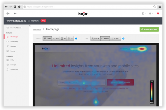
Heat mapping provides a visual representation where you can see where visitors are clicking throughout your site, not to mention where they’re not clicking.
Color coding reveals the intensity of those clicks.

Heat maps can uncover some pretty unexpected data.
I came across an interesting heat map once that revealed that most of the clicks on the Home page were made on the About Us button of all things.
We know that a percentage of shoppers want to find out more about the people behind a business. This particular heat map really verified that.
You may also find clicks on page elements that aren’t links. It’s possible that visitors are seeing these elements as a way to get to what they want. Having them do nothing frustrates the visitor. Either these elements should be linked to what they imply they lead to, or they should be redesigned to look less clickable. Clicks on unlinked elements may also indicate the real navigation elements are confusing or hard to find.
Visitor Playback Sessions
Visitor playback sessions go a step further by providing an actual video of the mouse activity as visitors browse throughout your site.
You’re able to see exactly where they stop, scroll and click.
Live User Testing
A variety of services let you actually view and listen to users as they navigate your site. (These are users recruited by you or a service – you can’t spy on unsuspecting regular visitors!) This type of study can help you understand not just where they are getting stuck or having issues, but why.
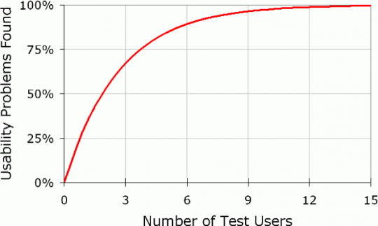
Surprisingly, even small numbers of test users can yield useful results.
Based on his formula N (1-(1- L ) n ) usability expert Jakob Nielsen states that a mere five user tests will identify 85% of the issues on a website. 15 user tests will uncover essentially all of the issues.

Form & Funnel Analysis
Funnel & form analysis gives you data on where visitors are dropping out of your forms and your conversion funnels. With this information, you can address the issues that are reducing conversion. Perhaps a form field can be eliminated or at least explained better. If visitors are dropping out before advancing to the next page, perhaps the link to proceed can be made more visible and the call to keep moving more friendly. If a visitor isn’t sure what “Continue” means, she may think it places an order she’s not ready to commit to. Uncertainty about what happens when you click will reduce clicks.
Conclusion
Do you see now why it’s so important to get visitors to engage with your site, engage with your visitors and track that engagement?
A nice design, persuasive copy and strong calls to action are all important.
But if you can really make your site interactive and are also available to interact with your visitors – you’re adding an entirely new dimension to your marketing message.
Engagement.
And when visitors are engaged, they are more committed.
So, how can you not put more emphasis on making your site more engaging?
Using the right tools to engage your visitors, and track that engagement will help you create a better visitor experience that converts more visitors into buyers.
