Your Brain on Soup
Soup is a product you probably don’t lust for. Sure, a hot bowl of soup is nice after a chilly job of shoveling snow out of the driveway, but rarely is it more than an afterthought, or a quick prelude to a more interesting main course. If you are Campbell Soup Co., though, you DO spend a lot of time thinking about soup. And, as detailed by the Wall Street Journal, they want to understand YOUR hidden feelings about soup to improve their packaging:
Campbell’s marketers were stymied by several problems. First, consumers just didn’t think much about soup, making meaningful market research difficult. Furthermore, they found that traditional market research techniques like asking about ad recall and intent to purchase seemed to correlate poorly with actual buyer behavior. (That shouldn’t come as a shock to regular Neuromarketing readers.) So, they turned to neuromarketing and biometric research:
By 2008 Mr. Woodard settled on the biometric tools combined with a different type of deep interview to more accurately gauge which consumer communications worked better. Campbell then hired Innerscope Research Inc., a Boston company that measures bodily responses, and other firms to help conduct research.
To be sure, neuromarketing techniques have their doubters. And biometrics tell only if a person reacted to something, not whether they liked or disliked something, and sample sizes tend to be small.
Carl Marci, an Innerscope founder, says his tools can’ t pinpoint what emotions a person feels. But if all the biological metrics move simultaneously in the same direction, the subject is likely to be emotionally engaging with something. [From The Wall Street Journal – The Emotional Quotient of Soup Shopping by Ilan Brat.]
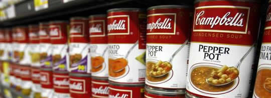
Campbell knew that people actually had a warm emotional feeling about their products. (When you were sick or cold, your mother fed you soup, right? Maybe even Campbell’s soup.) But biometric monitoring showed that this warmth faded in the supermarket soup aisle when the consumer was confronted with a wall of nearly identical red and white cans. So, Campbell started evaluating a series of design changes while monitoring how consumers responded to them.
Based on their biometric testing, Campbell will soon begin rolling out new displays and packaging to try to connect better with customers’ emotions. Key characteristics are:
- Different color packaging for different lines of soups.
- A smaller logo.
- Spoons won’t be pictured.
- Soup pictures will be more vibrant and “steamy.”
Hats off to the Wall Street Journal and reporter Ilan Brat for getting Campbell to go on record for this interesting story that documents the failure of traditional market research and how biometric techniques were used to make specific marketing changes. We hope there’s a follow-up story in a year or so to document the effects of the new displays and packaging.
Roger – As you and some of your readers may know, we have an active neuromarketing discussion group on Linked In. The WSJ Campbell Soup story generated extensive discussion about how this was a fair representation of the field as compared to the usual “mind control” approach that the media has a tendency to apply to neuromarketing.
There was also extensive discussion that Campbell’s strategy and planning encompassed several market research methodologies along with neuromarketing. Insights accumulated from neuromarketing is an adjunct not a sole source for achieving best results. I am copying below Matt Tullman’s comment on the new CSC soup strategy since his firm and others were deeply involved and deserve also the recognition of an excellent case study.
Best
Ron Wright
CEO / Sands Research Inc.
http://www.sandsresearch.com
From LinkedIn Neuromarketing Discussion Group:
==================================
“Totally agreed this is correct way to approach studies of this nature. Far too often a single cutting-edge technology is deployed into projects for technology’s sake, without recognizing the importance of cross-method support/validation. Not so in this case. CSC has a great philosophy and was very careful with their plan. They will reap benefits from the body of knowledge they procured far beyond what was reported. To Steve’s comment, it was Campbells who initiated the story with the Journal and invited the suppliers.
Selfishly, I have to point out that the facts were a bit jumbled in the article and were not reflective of all the research firms that participated in this 2 year study. For the record, Merchant Mechanics supplied this initiative with the only measures obtained from non-prerecruited consumers actually shopping in the aisle (deployed qual shop-alongs with mobile eye tracking & pupillometry, videographic behavioral analysis, real-time facial expression analysis and quant intercepts.) In addition, Olson Zaltman Assoc. was the supplier of the ‘deep interviews’ mentioned, but not named.
Matt Tullman
CEO
Merchant Mechanics, Inc.
PS – The funny story is that we were all scheduled to be part of the interview for this piece, but all flights were cancelled from the snow storm in Philly that week. Innerscope drove after plane and train cancellations! Kudos to them for making the trip, to be sure. In this case, as the saying goes, showing up is more than half the battle.
As can be read into the comment, we’re still feeling a bit sore about this WSJ article.”
as a brand consulting partner, the one change i find most interesting is the smaller logo — most brand managers want to make their logos as large as possible — campbell’s change seems to suggest that might not always be the right approach, particularly for such an iconic brand.
The “deep interview” referred to here is Zaltman Metaphor Elicitation Techinique (ZMET) by OZA right? Think thats what was in WSJ. Limitations to more traditional research being that it is difficult to capture unarticulated and visual thought process. Indeed a boild move by Campbell’s to non traditional research that is gaining more momentum
Denise makes an interesting point about the size of the logo. My take is that people are now more persuaded to buy the product more on the way the packaging makes them FEEL, than who actually makes it.
I’ve found this to be the case with myself. I always used to buy Heinz soup because, well, I’d always bought that brand. It was just habit. Nowadays, I’ve found myself being more drawn to the feelings I have when I look at the tin. So, these days I’ve bought Campbells and other makes too. That wouldn’t have happened a few years ago.
Damien
Bread Maker
It’s true that every time I went to a supermarket there’s a wall of identical red and white cans on the shelves, too many options that Campbell really needs a stand out package design. When there’s too many choices, I tend to go for the one either with attractive design and/or price.
Anyway I reckon the “Soup pictures will be more vibrant and “steamy.”” is a really good idea, it could actually got me to buy it especially during the winter 🙂
Bryan
best pedometer
One of the main problems with multi-brand retails and departmental stores has been that people have been spoilt for choices. Instead of going for new branding and cartoon, Campbell can actually reserve a particular space in the store and then highlight it with banners and vibrant pictures.
They should test with other options before going for such a critical change like branding.
Regards
Sourav